Are
Are
you
you
ready?
ready?
Are
Are
you
you
ready?
ready?
Are
Are
you
you
ready?
ready?
Are
Are
you
you
ready?
ready?
Garda Oto
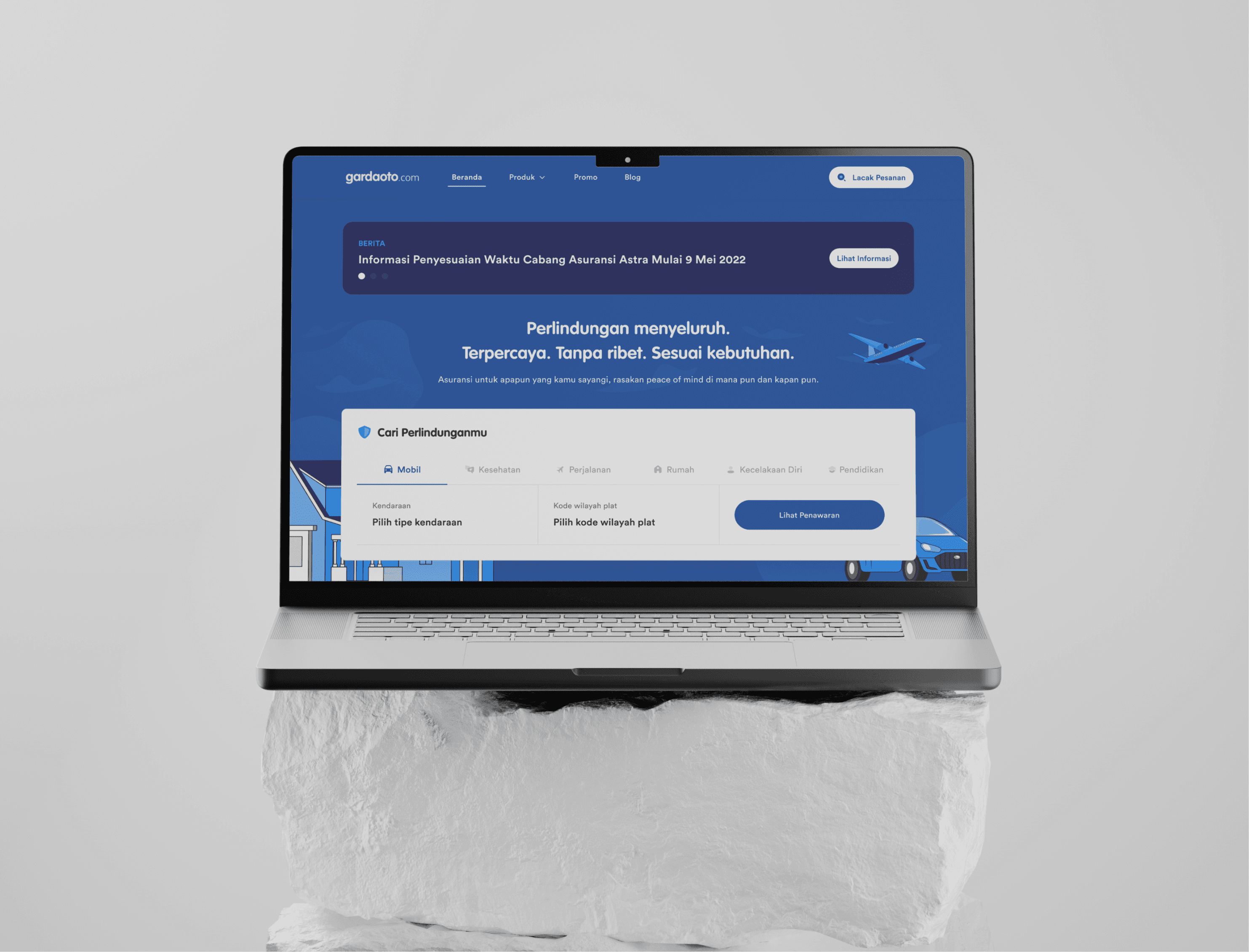
This project involves the complete revamp of the Garda Oto website. The website is designed to offer insurance services, including Garda Oto, Garda Health Tech, Garda Trip, Garda Home, Garda Me, and Garda Edu. Each feature provides users with detailed information about insurance products, premiums, claims, and assistance.
Client
Asuransi Astra
Role
UI/UX Designer
Timeline
5 Months
Category
Insurance, Website Revamp
Insurance, Website Revamp
Website Link
Problem Statement
The Challenge
The Challenge
The previous Garda Oto website presented significant usability issues, making it difficult for users to navigate through insurance options. The interface was outdated, and important features such as insurance product information, claims processing, and assistance were buried within complicated menus. This resulted in users spending too much time finding key information, leading to frustration and a drop in user engagement.
The previous Garda Oto website presented significant usability issues, making it difficult for users to navigate through insurance options. The interface was outdated, and important features such as insurance product information, claims processing, and assistance were buried within complicated menus. This resulted in users spending too much time finding key information, leading to frustration and a drop in user engagement.
The Challenge
The previous Garda Oto website presented significant usability issues, making it difficult for users to navigate through insurance options. The interface was outdated, and important features such as insurance product information, claims processing, and assistance were buried within complicated menus. This resulted in users spending too much time finding key information, leading to frustration and a drop in user engagement.
User Frustations
User Frustations

Users struggled to locate specific insurance products and services easily.
Users struggled to locate specific insurance products and services easily.
Users struggled to locate specific insurance products and services easily.

The claims process was not intuitive, causing confusion and abandonment of the process.
The claims process was not intuitive, causing confusion and abandonment of the process.
The claims process was not intuitive, causing confusion and abandonment of the process.

Slow page load times and an unresponsive design, especially on mobile devices, made the user experience frustrating.
Slow page load times and an unresponsive design, especially on mobile devices, made the user experience frustrating.
Slow page load times and an unresponsive design, especially on mobile devices, made the user experience frustrating.
User Frustations
Users struggled to locate specific insurance products and services easily.
The claims process was not intuitive, causing confusion and abandonment of the process.
Slow page load times and an unresponsive design, especially on mobile devices, made the user experience frustrating.
Business Problem
Business Problem
Asuransi Astra faced a decline in customer engagement and a lack of conversions from the website due to poor user experience. The company needed to modernize its digital platform to better communicate its wide range of insurance services and improve customer satisfaction.
Asuransi Astra faced a decline in customer engagement and a lack of conversions from the website due to poor user experience. The company needed to modernize its digital platform to better communicate its wide range of insurance services and improve customer satisfaction.
Asuransi Astra faced a decline in customer engagement and a lack of conversions from the website due to poor user experience. The company needed to modernize its digital platform to better communicate its wide range of insurance services and improve customer satisfaction.
Business Problem
Asuransi Astra faced a decline in customer engagement and a lack of conversions from the website due to poor user experience. The company needed to modernize its digital platform to better communicate its wide range of insurance services and improve customer satisfaction.
Key Questions
Key Questions
"How can we create a more intuitive and user-friendly navigation for users to easily find insurance products and services?"
"How can we create a more intuitive and user-friendly navigation for users to easily find insurance products and services?"
"What design changes can improve the claims process, making it more accessible and efficient for users?"
"What design changes can improve the claims process, making it more accessible and efficient for users?"
"How can we enhance the overall website performance, ensuring faster load times and a seamless experience across all devices?"
"How can we enhance the overall website performance, ensuring faster load times and a seamless experience across all devices?"
"How can we create a more intuitive and user-friendly navigation for users to easily find insurance products and services?"
"What design changes can improve the claims process, making it more accessible and efficient for users?"
"How can we enhance the overall website performance, ensuring faster load times and a seamless experience across all devices?"
Key Questions
"How can we create a more intuitive and user-friendly navigation for users to easily find insurance products and services?"
"What design changes can improve the claims process, making it more accessible and efficient for users?"
"How can we enhance the overall website performance, ensuring faster load times and a seamless experience across all devices?"
Target Audience & User Research
Target Audience & User Research
To ensure the redesigned Garda Oto website met the needs of its users, we first identified the key demographics who would benefit from its services. The goal was to create a user experience that catered to a broad spectrum of individuals while maintaining a streamlined and intuitive interface. By understanding their behaviors, needs, and frustrations, we were able to tailor the site’s features to deliver a more personalized experience.
To ensure the redesigned Garda Oto website met the needs of its users, we first identified the key demographics who would benefit from its services. The goal was to create a user experience that catered to a broad spectrum of individuals while maintaining a streamlined and intuitive interface. By understanding their behaviors, needs, and frustrations, we were able to tailor the site’s features to deliver a more personalized experience.
To ensure the redesigned Garda Oto website met the needs of its users, we first identified the key demographics who would benefit from its services. The goal was to create a user experience that catered to a broad spectrum of individuals while maintaining a streamlined and intuitive interface. By understanding their behaviors, needs, and frustrations, we were able to tailor the site’s features to deliver a more personalized experience.
To ensure the redesigned Garda Oto website met the needs of its users, we first identified the key demographics who would benefit from its services. The goal was to create a user experience that catered to a broad spectrum of individuals while maintaining a streamlined and intuitive interface. By understanding their behaviors, needs, and frustrations, we were able to tailor the site’s features to deliver a more personalized experience.

Health-Conscious Individuals
Users interested in health-related insurance products such as Garda Health Tech.

Students & Families
Those seeking personal and educational insurance plans (Garda Me, Garda Edu) for comprehensive coverage.
Health-Conscious Individuals
Users interested in health-related insurance products such as Garda Health Tech.
Students & Families
Those seeking personal and educational insurance plans (Garda Me, Garda Edu) for comprehensive coverage.
User Research Method
User Research Method
User Interviews
Gathered insights from current users about the challenges they faced in navigating the existing website, particularly in finding insurance products and services.
Gathered insights from current users about the challenges they faced in navigating the existing website, particularly in finding insurance products and services.
Explored users' expectations for an improved claims process and how they envisioned a more efficient and intuitive system.
Explored users' expectations for an improved claims process and how they envisioned a more efficient and intuitive system.
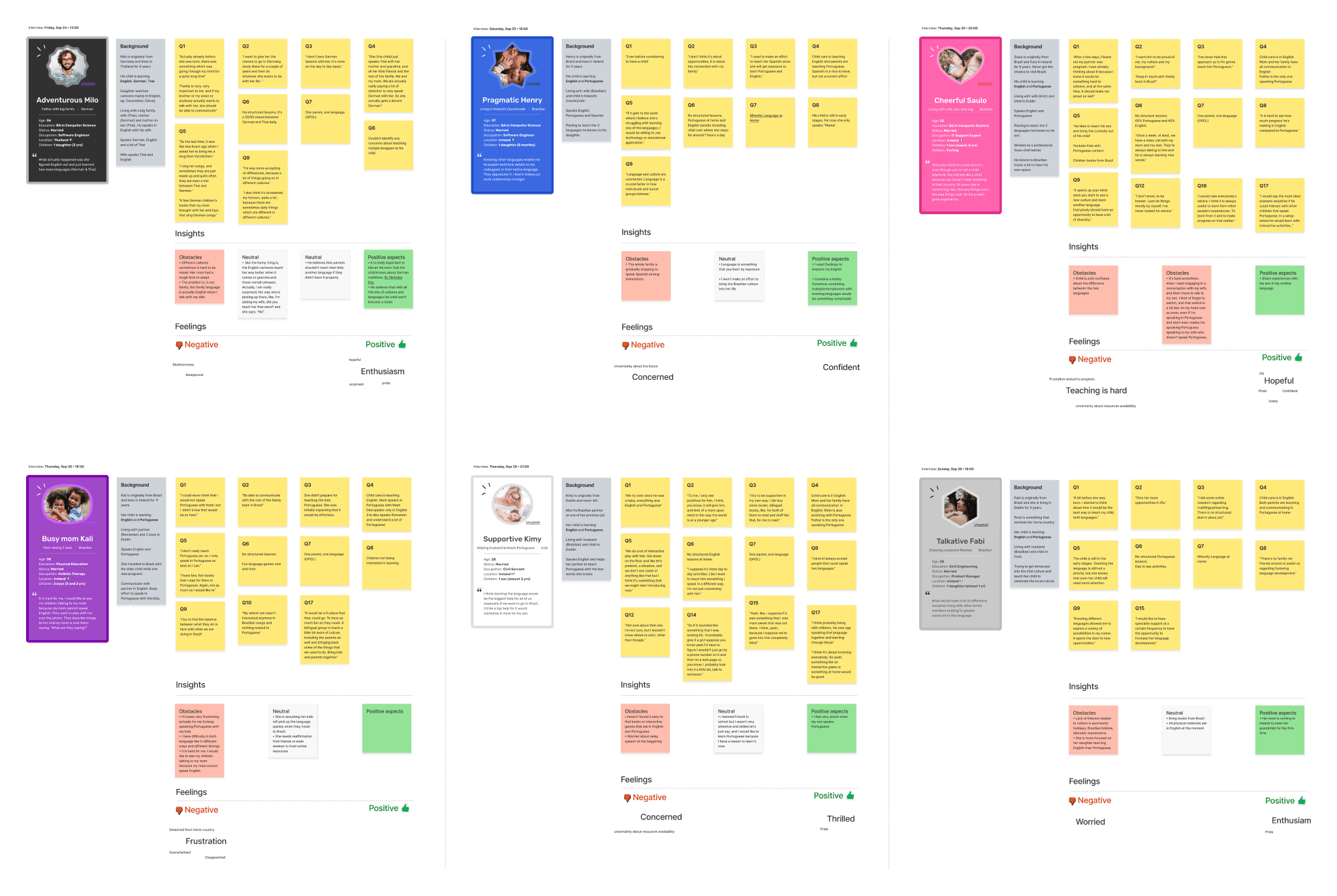
User Interviews
Gathered insights from current users about the challenges they faced in navigating the existing website, particularly in finding insurance products and services.
Explored users' expectations for an improved claims process and how they envisioned a more efficient and intuitive system.
Surveys
Distributed online surveys to reach a broader audience and collect quantitative data on user experiences and pain points with the current website.
Distributed online surveys to reach a broader audience and collect quantitative data on user experiences and pain points with the current website.
Key questions included:
What is the most challenging task on the current website?
How often do you use the website for claims or assistance?
What features or improvements would enhance your experience?
Key questions included:
What is the most challenging task on the current website?
How often do you use the website for claims or assistance?
What features or improvements would enhance your experience?
Surveys
Distributed online surveys to reach a broader audience and collect quantitative data on user experiences and pain points with the current website.
Key questions included:
What is the most challenging task on the current website?
How often do you use the website for claims or assistance?
What features or improvements would enhance your experience?
Competitor Analysis
We conducted an in-depth analysis of key competitors in the insurance sector to evaluate their website design, user experience, and service offerings. This involved reviewing features such as navigation, product presentation, claims processing, and customer support options.
By identifying best practices and innovative solutions employed by competitors, we gathered valuable insights that could inform our design decisions for the Garda Oto website. This analysis also highlighted areas where Garda Oto could differentiate itself, particularly in enhancing user engagement and accessibility.
Competitor Analysis
We conducted an in-depth analysis of key competitors in the insurance sector to evaluate their website design, user experience, and service offerings. This involved reviewing features such as navigation, product presentation, claims processing, and customer support options.
By identifying best practices and innovative solutions employed by competitors, we gathered valuable insights that could inform our design decisions for the Garda Oto website. This analysis also highlighted areas where Garda Oto could differentiate itself, particularly in enhancing user engagement and accessibility.
Key Insight
Key Insight
Through our extensive research and analysis, we uncovered several critical insights that will shape the design of the Garda Oto website. These findings reflect user needs and expectations, providing a clear direction for enhancing the overall user experience. By addressing these key areas, we can create a more effective platform that meets the demands of our diverse audience.
🌐 User-Centric Navigation
Users prioritize a straightforward navigation experience, highlighting the importance of an intuitive layout that allows them to find insurance products and services quickly.
Users prioritize a straightforward navigation experience, highlighting the importance of an intuitive layout that allows them to find insurance products and services quickly.
Users prioritize a straightforward navigation experience, highlighting the importance of an intuitive layout that allows them to find insurance products and services quickly.
🛠️ Simplified Claims Process
🛠️ Simplified Claims Process
Many users expressed frustration with the complexity of the existing claims process, indicating a strong need for a more streamlined and accessible approach.
Many users expressed frustration with the complexity of the existing claims process, indicating a strong need for a more streamlined and accessible approach.
Many users expressed frustration with the complexity of the existing claims process, indicating a strong need for a more streamlined and accessible approach.
📱 Mobile Optimization Matters
📱 Mobile Optimization Matters
Competitors with responsive and user-friendly mobile designs reported higher engagement levels, underscoring the necessity for Garda Oto to enhance its mobile experience.
Competitors with responsive and user-friendly mobile designs reported higher engagement levels, underscoring the necessity for Garda Oto to enhance its mobile experience.
Competitors with responsive and user-friendly mobile designs reported higher engagement levels, underscoring the necessity for Garda Oto to enhance its mobile experience.
💬 Clear Communication is Key
💬 Clear Communication is Key
Providing clear and concise information about insurance offerings is essential. Users appreciate transparency, which can foster trust and improve overall satisfaction with the services.
Providing clear and concise information about insurance offerings is essential. Users appreciate transparency, which can foster trust and improve overall satisfaction with the services.
Providing clear and concise information about insurance offerings is essential. Users appreciate transparency, which can foster trust and improve overall satisfaction with the services.
🎯 Conclusion from Research
🎯 Conclusion from Research
The research conducted for the Garda Oto website revamp has revealed crucial insights into user behavior and preferences. Users are seeking a simplified and intuitive navigation experience that allows them to quickly access essential insurance information. The complexity of the existing claims process needs to be addressed to enhance user satisfaction and retention. Furthermore, the analysis highlighted the importance of mobile optimization and clear communication in fostering user trust and engagement. By integrating these findings into the redesign process, we can create a more effective and user-friendly platform that meets the diverse needs of our target audience.
The research conducted for the Garda Oto website revamp has revealed crucial insights into user behavior and preferences. Users are seeking a simplified and intuitive navigation experience that allows them to quickly access essential insurance information. The complexity of the existing claims process needs to be addressed to enhance user satisfaction and retention. Furthermore, the analysis highlighted the importance of mobile optimization and clear communication in fostering user trust and engagement. By integrating these findings into the redesign process, we can create a more effective and user-friendly platform that meets the diverse needs of our target audience.
The research conducted for the Garda Oto website revamp has revealed crucial insights into user behavior and preferences. Users are seeking a simplified and intuitive navigation experience that allows them to quickly access essential insurance information. The complexity of the existing claims process needs to be addressed to enhance user satisfaction and retention. Furthermore, the analysis highlighted the importance of mobile optimization and clear communication in fostering user trust and engagement. By integrating these findings into the redesign process, we can create a more effective and user-friendly platform that meets the diverse needs of our target audience.
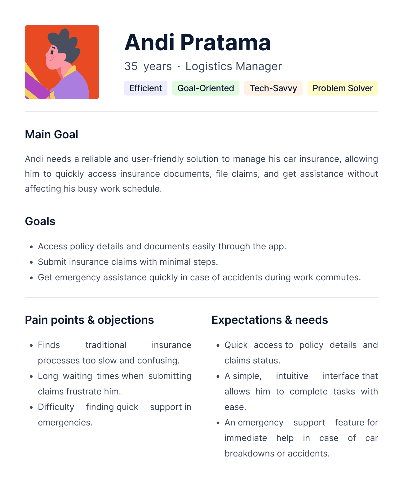
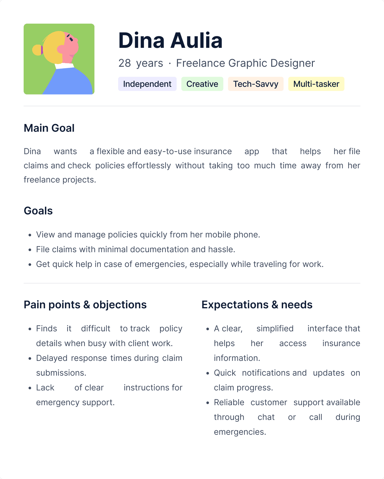
User Personas
User Personas
To effectively design the Garda Oto website, we developed user personas that represent our target audience. These personas embody the diverse needs, goals, and frustrations of potential users, providing valuable insights into their expectations when interacting with insurance services online. By understanding these personas, we can tailor the website experience to better meet user demands, ensuring that each persona's unique requirements are addressed in the redesign process.
To effectively design the Garda Oto website, we developed user personas that represent our target audience. These personas embody the diverse needs, goals, and frustrations of potential users, providing valuable insights into their expectations when interacting with insurance services online. By understanding these personas, we can tailor the website experience to better meet user demands, ensuring that each persona's unique requirements are addressed in the redesign process.
To effectively design the Garda Oto website, we developed user personas that represent our target audience. These personas embody the diverse needs, goals, and frustrations of potential users, providing valuable insights into their expectations when interacting with insurance services online. By understanding these personas, we can tailor the website experience to better meet user demands, ensuring that each persona's unique requirements are addressed in the redesign process.
🎯 Conclusion from Personas
🎯 Conclusion from Personas
The development of user personas has highlighted the diverse needs and expectations of our target audience for the Garda Oto website. Each persona represents distinct motivations, whether it’s the desire for affordable insurance options, clear information on coverage, or efficient claims processing. By addressing the specific pain points and goals of these personas, we can create a more inclusive and user-centered design. Understanding these personas will guide our design decisions, ensuring that we deliver a website experience that resonates with users and enhances their overall satisfaction with our services.
The development of user personas has highlighted the diverse needs and expectations of our target audience for the Garda Oto website. Each persona represents distinct motivations, whether it’s the desire for affordable insurance options, clear information on coverage, or efficient claims processing. By addressing the specific pain points and goals of these personas, we can create a more inclusive and user-centered design. Understanding these personas will guide our design decisions, ensuring that we deliver a website experience that resonates with users and enhances their overall satisfaction with our services.
The development of user personas has highlighted the diverse needs and expectations of our target audience for the Garda Oto website. Each persona represents distinct motivations, whether it’s the desire for affordable insurance options, clear information on coverage, or efficient claims processing. By addressing the specific pain points and goals of these personas, we can create a more inclusive and user-centered design. Understanding these personas will guide our design decisions, ensuring that we deliver a website experience that resonates with users and enhances their overall satisfaction with our services.
User Journey & Pain Point
User Journey & Pain Point
Understanding the user journey is essential for identifying the critical steps users take while interacting with the Garda Oto website. By mapping out this journey, we can pinpoint specific pain points that users encounter at various stages, from initial awareness to post-purchase experiences. This insight allows us to address challenges effectively and create a more seamless and satisfying experience for users, ultimately leading to higher engagement and satisfaction with our insurance services.
Understanding the user journey is essential for identifying the critical steps users take while interacting with the Garda Oto website. By mapping out this journey, we can pinpoint specific pain points that users encounter at various stages, from initial awareness to post-purchase experiences. This insight allows us to address challenges effectively and create a more seamless and satisfying experience for users, ultimately leading to higher engagement and satisfaction with our insurance services.
Understanding the user journey is essential for identifying the critical steps users take while interacting with the Garda Oto website. By mapping out this journey, we can pinpoint specific pain points that users encounter at various stages, from initial awareness to post-purchase experiences. This insight allows us to address challenges effectively and create a more seamless and satisfying experience for users, ultimately leading to higher engagement and satisfaction with our insurance services.
🎯 Conclusion from User Journeys
🎯 Conclusion from User Journeys
The analysis of the user journey for the Garda Oto website has illuminated critical pain points that users face at various stages of their experience. By understanding these challenges—from initial awareness to post-purchase management—we can prioritize solutions that enhance usability and accessibility. Addressing issues such as complex navigation, lengthy application processes, and confusing claims procedures is essential for creating a more streamlined experience. By implementing user-centric design improvements based on these insights, we can foster greater user satisfaction and loyalty, ultimately driving better engagement with our insurance offerings.
The analysis of the user journey for the Garda Oto website has illuminated critical pain points that users face at various stages of their experience. By understanding these challenges—from initial awareness to post-purchase management—we can prioritize solutions that enhance usability and accessibility. Addressing issues such as complex navigation, lengthy application processes, and confusing claims procedures is essential for creating a more streamlined experience. By implementing user-centric design improvements based on these insights, we can foster greater user satisfaction and loyalty, ultimately driving better engagement with our insurance offerings.
The analysis of the user journey for the Garda Oto website has illuminated critical pain points that users face at various stages of their experience. By understanding these challenges—from initial awareness to post-purchase management—we can prioritize solutions that enhance usability and accessibility. Addressing issues such as complex navigation, lengthy application processes, and confusing claims procedures is essential for creating a more streamlined experience. By implementing user-centric design improvements based on these insights, we can foster greater user satisfaction and loyalty, ultimately driving better engagement with our insurance offerings.
Design Process
Design Process
Information Architecture
Following the wireframing stage, we focused on developing the information architecture for the Garda Oto website. This involved organizing the website's content and functionality in a logical manner to ensure a seamless user experience. We created a sitemap that outlined the main sections and sub-sections of the site, enabling users to navigate intuitively. This clear structure helps minimize user frustration and enhances overall usability, making it easier for users to find the information they need quickly.
Following the wireframing stage, we focused on developing the information architecture for the Garda Oto website. This involved organizing the website's content and functionality in a logical manner to ensure a seamless user experience. We created a sitemap that outlined the main sections and sub-sections of the site, enabling users to navigate intuitively. This clear structure helps minimize user frustration and enhances overall usability, making it easier for users to find the information they need quickly.
Following the wireframing stage, we focused on developing the information architecture for the Garda Oto website. This involved organizing the website's content and functionality in a logical manner to ensure a seamless user experience. We created a sitemap that outlined the main sections and sub-sections of the site, enabling users to navigate intuitively. This clear structure helps minimize user frustration and enhances overall usability, making it easier for users to find the information they need quickly.
Wireframe Sketches & Collaboration
Wireframe Sketches & Collaboration
In the initial stage, our team conducted collaborative brainstorming sessions to create rough wireframe sketches. These sketches served as a foundation for visualizing the website layout and structure, ensuring that all team members contributed their insights and ideas.
In the initial stage, our team conducted collaborative brainstorming sessions to create rough wireframe sketches. These sketches served as a foundation for visualizing the website layout and structure, ensuring that all team members contributed their insights and ideas.
In the initial stage, our team conducted collaborative brainstorming sessions to create rough wireframe sketches. These sketches served as a foundation for visualizing the website layout and structure, ensuring that all team members contributed their insights and ideas.
This collaborative approach allowed us to iterate quickly based on feedback and refine our design concepts. Engaging in open discussions during this phase fostered creativity and alignment among the team, setting a strong foundation for the subsequent design phases.
This collaborative approach allowed us to iterate quickly based on feedback and refine our design concepts. Engaging in open discussions during this phase fostered creativity and alignment among the team, setting a strong foundation for the subsequent design phases.
This collaborative approach allowed us to iterate quickly based on feedback and refine our design concepts. Engaging in open discussions during this phase fostered creativity and alignment among the team, setting a strong foundation for the subsequent design phases.
Mid-fidelity Wireframes
Once the information architecture was established, we moved on to developing mid-fidelity wireframes that provided a more detailed representation of the website's layout and functionality. These wireframes included annotations to specify design elements, interactions, and user flows, allowing us to visualize how users would navigate through the site. We use Miro to brainstorm and develop wireframes.
Once the information architecture was established, we moved on to developing mid-fidelity wireframes that provided a more detailed representation of the website's layout and functionality. These wireframes included annotations to specify design elements, interactions, and user flows, allowing us to visualize how users would navigate through the site. We use Miro to brainstorm and develop wireframes.
Once the information architecture was established, we moved on to developing mid-fidelity wireframes that provided a more detailed representation of the website's layout and functionality. These wireframes included annotations to specify design elements, interactions, and user flows, allowing us to visualize how users would navigate through the site. We use Miro to brainstorm and develop wireframes.
This phase revealed crucial insights about user experience, highlighting the need for clearer labels and intuitive navigation paths. Feedback from the team indicated areas where users might experience confusion, enabling us to address potential issues early in the design process to enhance overall usability.
This phase revealed crucial insights about user experience, highlighting the need for clearer labels and intuitive navigation paths. Feedback from the team indicated areas where users might experience confusion, enabling us to address potential issues early in the design process to enhance overall usability.
This phase revealed crucial insights about user experience, highlighting the need for clearer labels and intuitive navigation paths. Feedback from the team indicated areas where users might experience confusion, enabling us to address potential issues early in the design process to enhance overall usability.

UI Design & High-fidelity Mockups
UI Design & High-fidelity Mockups
With the mid-fidelity wireframes validated, we transitioned to the UI design phase. During this phase, we created high-fidelity mockups that incorporated visual design elements, color schemes, and typography.
With the mid-fidelity wireframes validated, we transitioned to the UI design phase. During this phase, we created high-fidelity mockups that incorporated visual design elements, color schemes, and typography.
With the mid-fidelity wireframes validated, we transitioned to the UI design phase. During this phase, we created high-fidelity mockups that incorporated visual design elements, color schemes, and typography.
This stage emphasized branding consistency and aesthetics while ensuring that the design remained user-friendly and accessible. We aimed to create a visually appealing interface that aligns with the Garda Oto brand and effectively communicates essential information to users.
This stage emphasized branding consistency and aesthetics while ensuring that the design remained user-friendly and accessible. We aimed to create a visually appealing interface that aligns with the Garda Oto brand and effectively communicates essential information to users.
This stage emphasized branding consistency and aesthetics while ensuring that the design remained user-friendly and accessible. We aimed to create a visually appealing interface that aligns with the Garda Oto brand and effectively communicates essential information to users.

Usability Testing
Usability Testing
To validate our design, we conducted usability testing with real users to gather feedback on the website's functionality and user experience. Participants were asked to complete specific tasks while observing their interactions and gathering qualitative data on their experiences.
To validate our design, we conducted usability testing with real users to gather feedback on the website's functionality and user experience. Participants were asked to complete specific tasks while observing their interactions and gathering qualitative data on their experiences.
To validate our design, we conducted usability testing with real users to gather feedback on the website's functionality and user experience. Participants were asked to complete specific tasks while observing their interactions and gathering qualitative data on their experiences.
This feedback was instrumental in identifying areas for improvement and making necessary adjustments to enhance the overall user experience.
This feedback was instrumental in identifying areas for improvement and making necessary adjustments to enhance the overall user experience.
This feedback was instrumental in identifying areas for improvement and making necessary adjustments to enhance the overall user experience.
🎯 Key Findings from the Usability Tests
Through usability testing, we discovered several key findings that informed our design decisions. Users appreciated the streamlined navigation and clarity of information but expressed a desire for more visual cues to guide them through the claims process. These insights will be critical as we finalize the design and prepare for implementation.
Through usability testing, we discovered several key findings that informed our design decisions. Users appreciated the streamlined navigation and clarity of information but expressed a desire for more visual cues to guide them through the claims process. These insights will be critical as we finalize the design and prepare for implementation.
Through usability testing, we discovered several key findings that informed our design decisions. Users appreciated the streamlined navigation and clarity of information but expressed a desire for more visual cues to guide them through the claims process. These insights will be critical as we finalize the design and prepare for implementation.
Reflection & Key Takeaways
Reflection & Key Takeaways
🗣️ Importance of User Feedback
Engaging users early and consistently helped us identify pain points and clarify their needs, ultimately leading to a more effective and user-centered design.🤝 Collaboration Among Team Members
Brainstorming sessions fostered creativity and innovation, allowing for diverse perspectives that enriched the final design.🔄 Flexibility in Design
The iterative process of wireframing and usability testing highlighted the need for flexibility. By being open to change and responsive to user feedback, we were able to create a more intuitive and accessible experience.📐 Structured Design Process
A structured design process that prioritizes user needs, promotes team collaboration, and embraces feedback is crucial for creating effective digital experiences.
User Research Method
User Interviews
Gathered insights from current users about the challenges they faced in navigating the existing website, particularly in finding insurance products and services.
Explored users' expectations for an improved claims process and how they envisioned a more efficient and intuitive system.
Surveys
Distributed online surveys to reach a broader audience and collect quantitative data on user experiences and pain points with the current website.
Key questions included:
What is the most challenging task on the current website?
How often do you use the website for claims or assistance?
What features or improvements would enhance your experience?
Competitor Analysis
We conducted an in-depth analysis of key competitors in the insurance sector to evaluate their website design, user experience, and service offerings. This involved reviewing features such as navigation, product presentation, claims processing, and customer support options.
By identifying best practices and innovative solutions employed by competitors, we gathered valuable insights that could inform our design decisions for the Garda Oto website. This analysis also highlighted areas where Garda Oto could differentiate itself, particularly in enhancing user engagement and accessibility.
Key Insight
Through our extensive research and analysis, we uncovered several critical insights that will shape the design of the Garda Oto website. These findings reflect user needs and expectations, providing a clear direction for enhancing the overall user experience. By addressing these key areas, we can create a more effective platform that meets the demands of our diverse audience.
🌐 User-Centric Navigation
Users prioritize a straightforward navigation experience, highlighting the importance of an intuitive layout that allows them to find insurance products and services quickly.
🛠️ Simplified Claims Process
Many users expressed frustration with the complexity of the existing claims process, indicating a strong need for a more streamlined and accessible approach.
📱 Mobile Optimization Matters
Competitors with responsive and user-friendly mobile designs reported higher engagement levels, underscoring the necessity for Garda Oto to enhance its mobile experience.
💬 Clear Communication is Key
Providing clear and concise information about insurance offerings is essential. Users appreciate transparency, which can foster trust and improve overall satisfaction with the services.
🎯 Conclusion from Research
The research conducted for the Garda Oto website revamp has revealed crucial insights into user behavior and preferences. Users are seeking a simplified and intuitive navigation experience that allows them to quickly access essential insurance information. The complexity of the existing claims process needs to be addressed to enhance user satisfaction and retention. Furthermore, the analysis highlighted the importance of mobile optimization and clear communication in fostering user trust and engagement. By integrating these findings into the redesign process, we can create a more effective and user-friendly platform that meets the diverse needs of our target audience.
User Personas
To effectively design the Garda Oto website, we developed user personas that represent our target audience. These personas embody the diverse needs, goals, and frustrations of potential users, providing valuable insights into their expectations when interacting with insurance services online. By understanding these personas, we can tailor the website experience to better meet user demands, ensuring that each persona's unique requirements are addressed in the redesign process.
🎯 Conclusion from Personas
The development of user personas has highlighted the diverse needs and expectations of our target audience for the Garda Oto website. Each persona represents distinct motivations, whether it’s the desire for affordable insurance options, clear information on coverage, or efficient claims processing. By addressing the specific pain points and goals of these personas, we can create a more inclusive and user-centered design. Understanding these personas will guide our design decisions, ensuring that we deliver a website experience that resonates with users and enhances their overall satisfaction with our services.
User Journey & Pain Point
Understanding the user journey is essential for identifying the critical steps users take while interacting with the Garda Oto website. By mapping out this journey, we can pinpoint specific pain points that users encounter at various stages, from initial awareness to post-purchase experiences. This insight allows us to address challenges effectively and create a more seamless and satisfying experience for users, ultimately leading to higher engagement and satisfaction with our insurance services.
🎯 Conclusion from User Journeys
The analysis of the user journey for the Garda Oto website has illuminated critical pain points that users face at various stages of their experience. By understanding these challenges—from initial awareness to post-purchase management—we can prioritize solutions that enhance usability and accessibility. Addressing issues such as complex navigation, lengthy application processes, and confusing claims procedures is essential for creating a more streamlined experience. By implementing user-centric design improvements based on these insights, we can foster greater user satisfaction and loyalty, ultimately driving better engagement with our insurance offerings.
Design Process
Information Architecture
Following the wireframing stage, we focused on developing the information architecture for the Garda Oto website. This involved organizing the website's content and functionality in a logical manner to ensure a seamless user experience. We created a sitemap that outlined the main sections and sub-sections of the site, enabling users to navigate intuitively. This clear structure helps minimize user frustration and enhances overall usability, making it easier for users to find the information they need quickly.
Wireframe Sketches & Collaboration
In the initial stage, our team conducted collaborative brainstorming sessions to create rough wireframe sketches. These sketches served as a foundation for visualizing the website layout and structure, ensuring that all team members contributed their insights and ideas.
This collaborative approach allowed us to iterate quickly based on feedback and refine our design concepts. Engaging in open discussions during this phase fostered creativity and alignment among the team, setting a strong foundation for the subsequent design phases.
Mid-fidelity Wireframes
Once the information architecture was established, we moved on to developing mid-fidelity wireframes that provided a more detailed representation of the website's layout and functionality. These wireframes included annotations to specify design elements, interactions, and user flows, allowing us to visualize how users would navigate through the site. We use Miro to brainstorm and develop wireframes.
This phase revealed crucial insights about user experience, highlighting the need for clearer labels and intuitive navigation paths. Feedback from the team indicated areas where users might experience confusion, enabling us to address potential issues early in the design process to enhance overall usability.
UI Design & High-fidelity Mockups
With the mid-fidelity wireframes validated, we transitioned to the UI design phase. During this phase, we created high-fidelity mockups that incorporated visual design elements, color schemes, and typography.
This stage emphasized branding consistency and aesthetics while ensuring that the design remained user-friendly and accessible. We aimed to create a visually appealing interface that aligns with the Garda Oto brand and effectively communicates essential information to users.
Usability Testing
To validate our design, we conducted usability testing with real users to gather feedback on the website's functionality and user experience. Participants were asked to complete specific tasks while observing their interactions and gathering qualitative data on their experiences.
This feedback was instrumental in identifying areas for improvement and making necessary adjustments to enhance the overall user experience.
🎯 Key Findings from the Usability Tests
Through usability testing, we discovered several key findings that informed our design decisions. Users appreciated the streamlined navigation and clarity of information but expressed a desire for more visual cues to guide them through the claims process. These insights will be critical as we finalize the design and prepare for implementation.
Reflection & Key Takeaways
🗣️ Importance of User Feedback
Engaging users early and consistently helped us identify pain points and clarify their needs, ultimately leading to a more effective and user-centered design.🤝 Collaboration Among Team Members
Brainstorming sessions fostered creativity and innovation, allowing for diverse perspectives that enriched the final design.🔄 Flexibility in Design
The iterative process of wireframing and usability testing highlighted the need for flexibility. By being open to change and responsive to user feedback, we were able to create a more intuitive and accessible experience.📐 Structured Design Process
A structured design process that prioritizes user needs, promotes team collaboration, and embraces feedback is crucial for creating effective digital experiences.
More Works More Works
More Works More Works
MyGarda
Mobile Application
2023
2023
MyGarda
Mobile Application
2023
2023
MyGarda
Mobile Application
2023
2023
MyGarda
Mobile Application
2023
2023

Innovate
Website App
2023
2023
Innovate
Website App
2023
2023
Innovate
Website App
2023
2023
Innovate
Website App
2023
2023
©2024 REYHAN AK
Go Back To Top
©2024 REYHAN AK
Go Back To Top