Are
Are
you
you
ready?
ready?
Are
Are
you
you
ready?
ready?
Are
Are
you
you
ready?
ready?
Are
Are
you
you
ready?
ready?
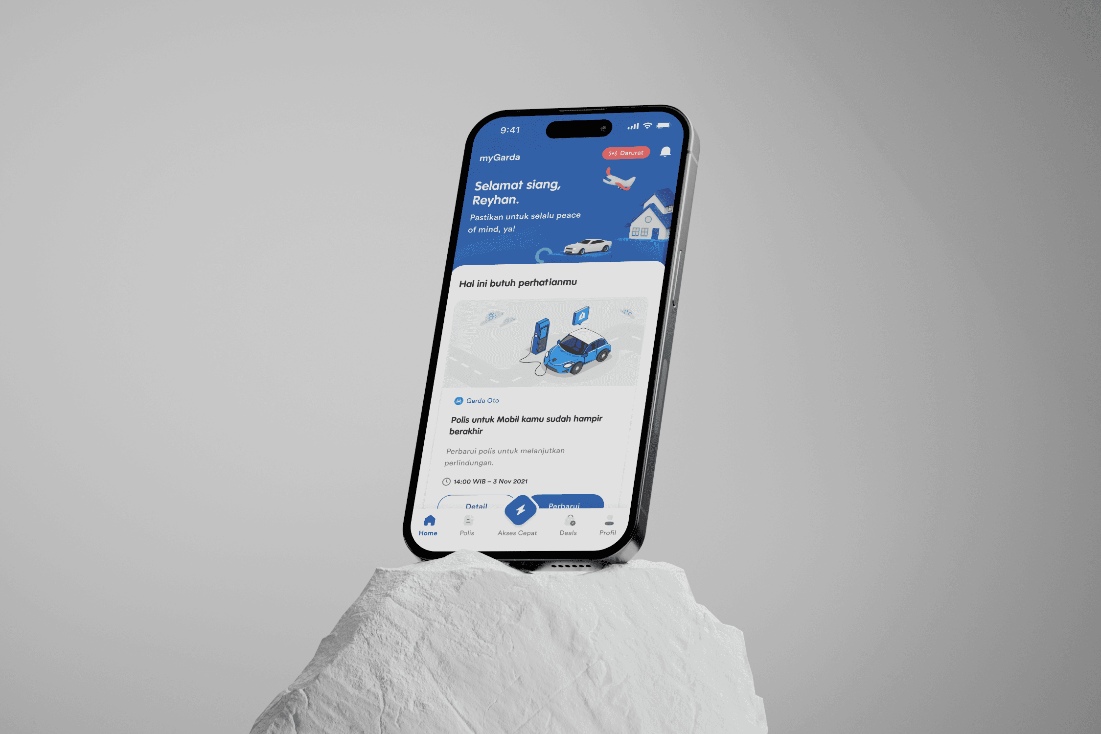
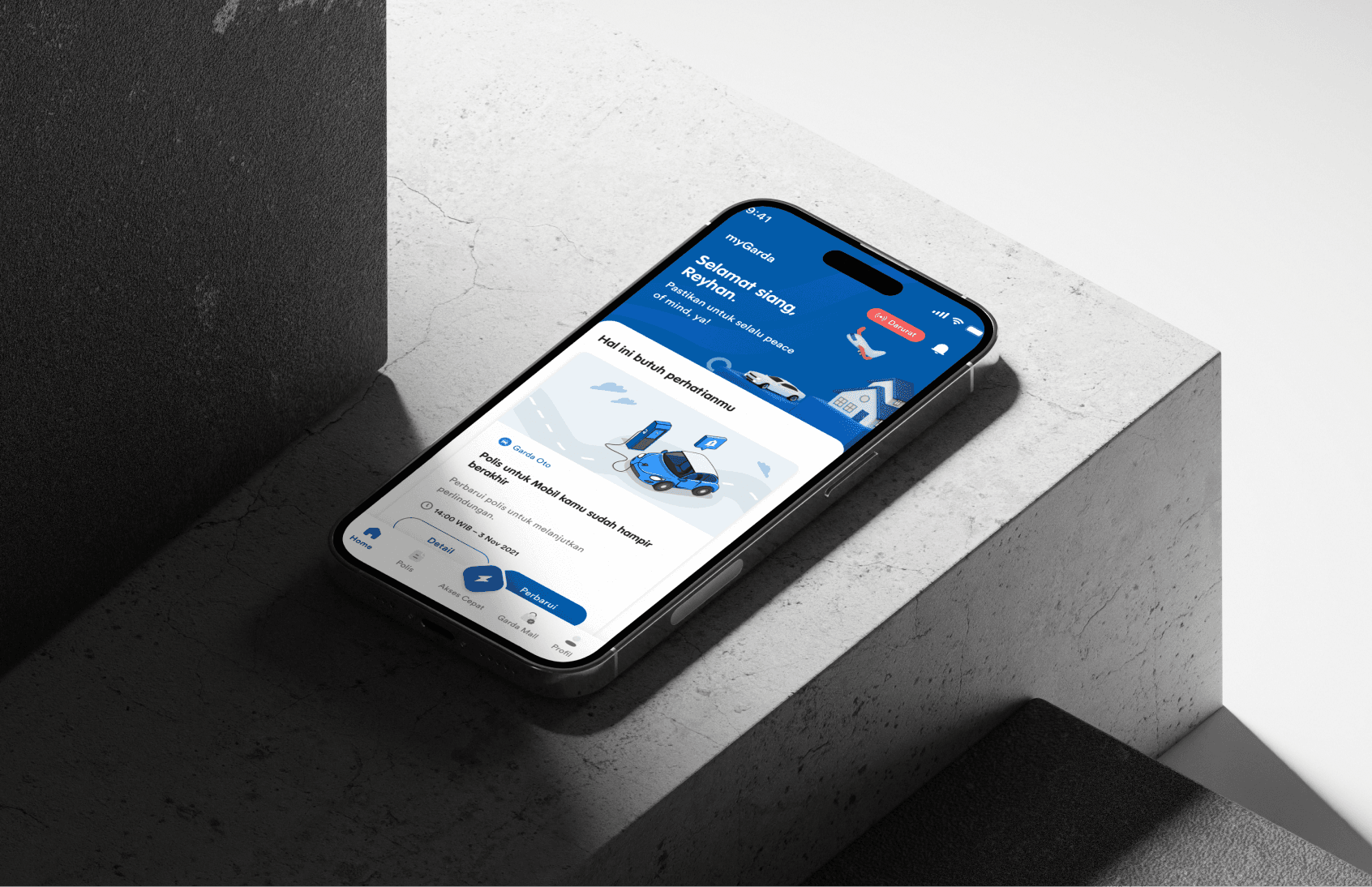
MyGarda
MyGarda is a mobile application developed by Asuransi Astra that simplifies access to insurance services, including policy management, claims, and emergency assistance.
Client
Asuransi Astra
Role
UI/UX Designer
Timeline
4 Months
Category
INSURANCE, MOBILE APP
INSURANCE, MOBILE APP
Problem Statement
Challenges
Challenges
Insurance management can often be complex and time consuming, especially when it comes to understanding policy details, filing claims, and accessing emergency services. Customers frequently experience delays and frustration when trying to navigate these processes, particularly in urgent situations like accidents or medical emergencies.
Insurance management can often be complex and time consuming, especially when it comes to understanding policy details, filing claims, and accessing emergency services. Customers frequently experience delays and frustration when trying to navigate these processes, particularly in urgent situations like accidents or medical emergencies.
Challenges
Insurance management can often be complex and time consuming, especially when it comes to understanding policy details, filing claims, and accessing emergency services. Customers frequently experience delays and frustration when trying to navigate these processes, particularly in urgent situations like accidents or medical emergencies.
User Frustations
User Frustations

Finding the necessary policy information quickly
Finding the necessary policy information quickly
Finding the necessary policy information quickly

Dealing with a complicated and long claim-filing process
Dealing with a complicated and long claim-filing process
Dealing with a complicated and long claim-filing process

Receiving timely assistance in emergencies, where every second counts
Receiving timely assistance in emergencies, where every second counts
Receiving timely assistance in emergencies, where every second counts
User Frustations
Finding the necessary policy information quickly
Dealing with a complicated and long claim-filing process
Receiving timely assistance in emergencies, where every second counts
Business Problems
Business Problems
Asuransi Astra recognized the need to enhance their customer experience through a mobile solution that provides users with instant access to insurance services. The traditional methods of managing insurance (phone calls, physical documentation, etc.) were outdated and didn’t meet modern customers' expectations for speed and convenience.
Asuransi Astra recognized the need to enhance their customer experience through a mobile solution that provides users with instant access to insurance services. The traditional methods of managing insurance (phone calls, physical documentation, etc.) were outdated and didn’t meet modern customers' expectations for speed and convenience.
Asuransi Astra recognized the need to enhance their customer experience through a mobile solution that provides users with instant access to insurance services. The traditional methods of managing insurance (phone calls, physical documentation, etc.) were outdated and didn’t meet modern customers' expectations for speed and convenience.
Business Problems
Asuransi Astra recognized the need to enhance their customer experience through a mobile solution that provides users with instant access to insurance services. The traditional methods of managing insurance (phone calls, physical documentation, etc.) were outdated and didn’t meet modern customers' expectations for speed and convenience.
Key Questions
Key Questions
"How can we streamline the process of filing claims and accessing policy details through a mobile app?"
"How can we streamline the process of filing claims and accessing policy details through a mobile app?"
"How can we ensure that users receive immediate assistance in emergencies with minimal friction?"
"How can we ensure that users receive immediate assistance in emergencies with minimal friction?"
"How can we simplify complex insurance information for a better user experience?"
"How can we simplify complex insurance information for a better user experience?"
"How can we streamline the process of filing claims and accessing policy details through a mobile app?"
"How can we ensure that users receive immediate assistance in emergencies with minimal friction?"
"How can we simplify complex insurance information for a better user experience?"
Key Questions
"How can we streamline the process of filing claims and accessing policy details through a mobile app?"
"How can we ensure that users receive immediate assistance in emergencies with minimal friction?"
"How can we simplify complex insurance information for a better user experience?"
Target Audience & User Research
Target Audience & User Research
Insurance management can often be complex and time consuming, especially when it comes to understanding policy details, filing claims, and accessing emergency services. Customers frequently experience delays and frustration when trying to navigate these processes, particularly in urgent situations like accidents or medical emergencies.
Insurance management can often be complex and time consuming, especially when it comes to understanding policy details, filing claims, and accessing emergency services. Customers frequently experience delays and frustration when trying to navigate these processes, particularly in urgent situations like accidents or medical emergencies.
Insurance management can often be complex and time consuming, especially when it comes to understanding policy details, filing claims, and accessing emergency services. Customers frequently experience delays and frustration when trying to navigate these processes, particularly in urgent situations like accidents or medical emergencies.
Insurance management can often be complex and time consuming, especially when it comes to understanding policy details, filing claims, and accessing emergency services. Customers frequently experience delays and frustration when trying to navigate these processes, particularly in urgent situations like accidents or medical emergencies.
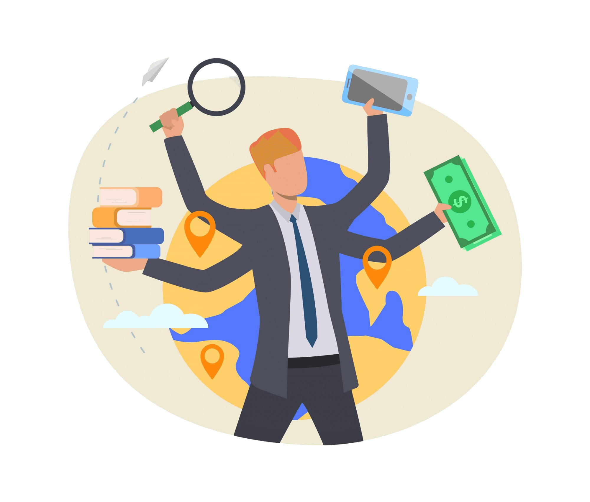
Busy Professionals
Individuals requiring swift and effective access to their insurance information because of their high-speed lifestyles.
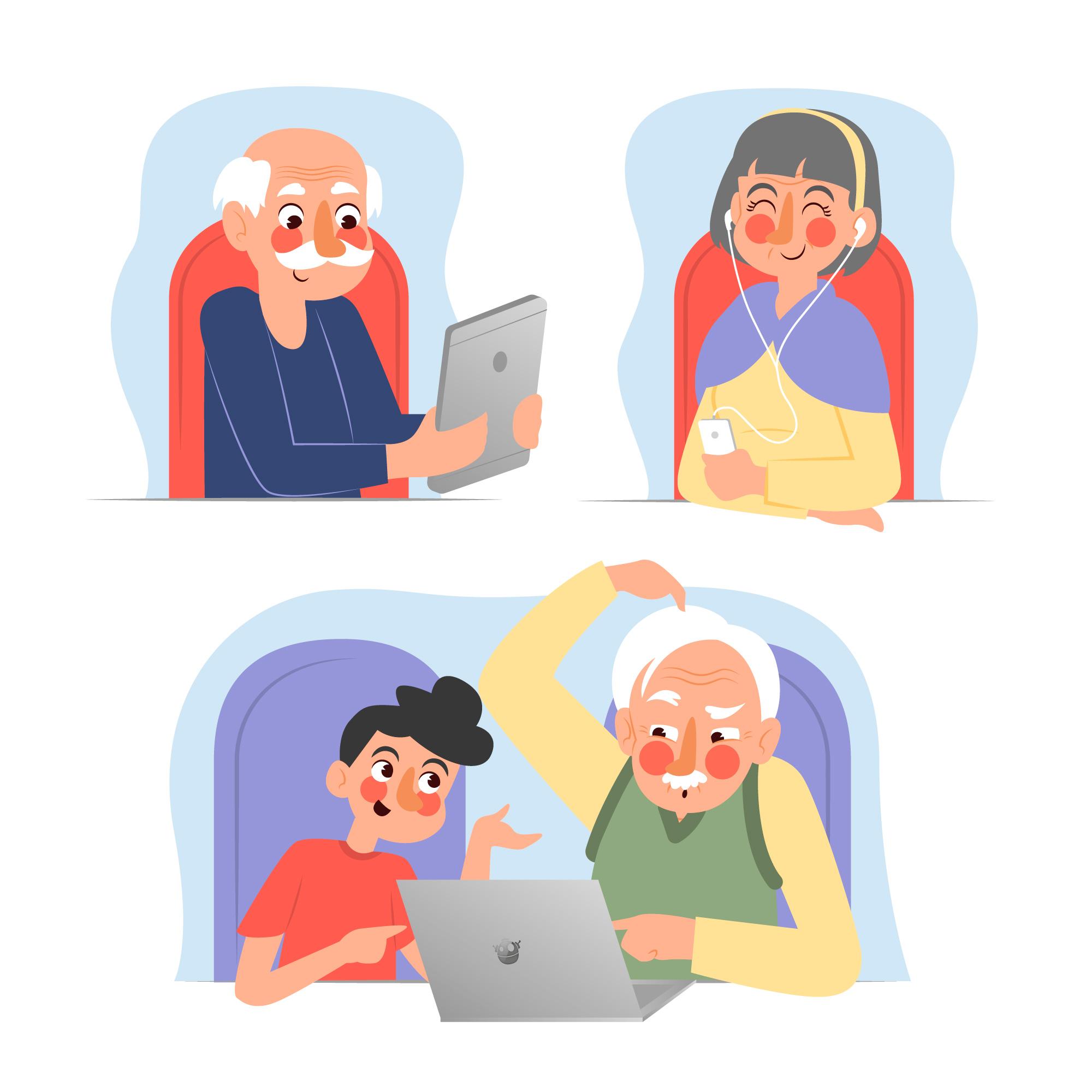
Elderly Users
Older individuals who might not be tech-savvy but require insurance services, particularly for health and emergency coverage.
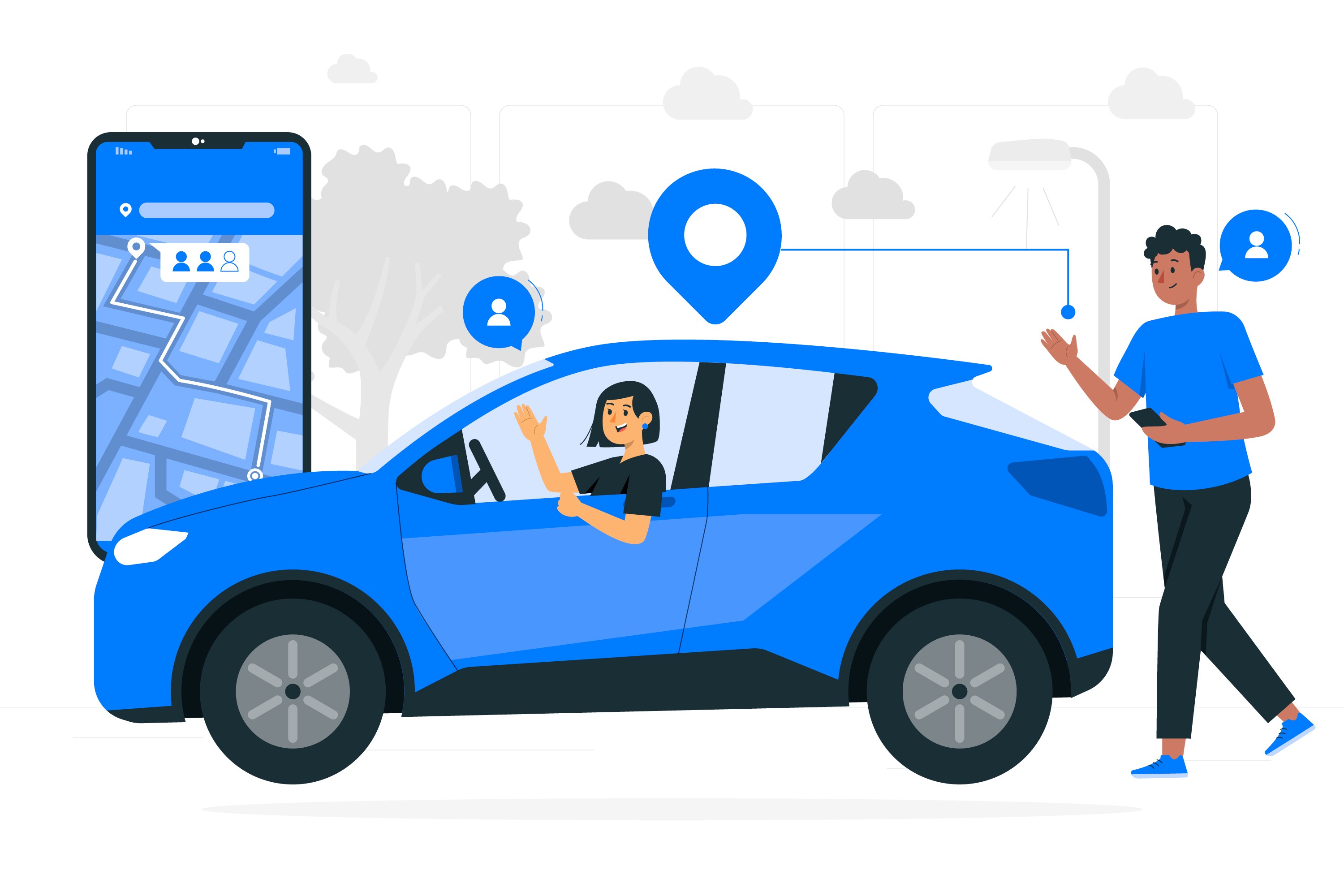
Drivers
Individuals who rely on their vehicles and need easy access to claims, especially in case of accidents.
Busy Professionals
Individuals requiring swift and effective access to their insurance information because of their high-speed lifestyles.
Elderly Users
Older individuals who might not be tech-savvy but require insurance services, particularly for health and emergency coverage.
Drivers
Individuals who rely on their vehicles and need easy access to claims, especially in case of accidents.
User Research Methods
User Research Methods
User Interviews
We conducted interviews with 20 current Asuransi Astra customers to gain insights into their experiences with managing insurance.
We conducted interviews with 20 current Asuransi Astra customers to gain insights into their experiences with managing insurance.
The focus was on their frustrations with current processes, what they expect from a mobile solution, and what their emergency service experiences have been.
The focus was on their frustrations with current processes, what they expect from a mobile solution, and what their emergency service experiences have been.
User Interviews
We conducted interviews with 20 current Asuransi Astra customers to gain insights into their experiences with managing insurance.
The focus was on their frustrations with current processes, what they expect from a mobile solution, and what their emergency service experiences have been.
Surveys
A broader survey was sent to over 100 customers to gather quantitative data on how they interact with insurance services and their comfort levels with mobile technology.
A broader survey was sent to over 100 customers to gather quantitative data on how they interact with insurance services and their comfort levels with mobile technology.
Key questions included:
How often do they need to file a claim?
How would they prefer to contact their insurer in an emergency?
What features do they most value in a mobile app?
Key questions included:
How often do they need to file a claim?
How would they prefer to contact their insurer in an emergency?
What features do they most value in a mobile app?
Surveys
A broader survey was sent to over 100 customers to gather quantitative data on how they interact with insurance services and their comfort levels with mobile technology.
Key questions included:
How often do they need to file a claim?
How would they prefer to contact their insurer in an emergency?
What features do they most value in a mobile app?
Competitive Analysis
We analyzed the mobile apps of several competitors in the insurance sector to understand how they addressed user needs. Initially, we identified the differences among these apps and then examined their similarities. This process allowed us to pinpoint essential features that users expect and uncover opportunities where MyGarda could differentiate itself. Our analysis focused on enhancing usability and improving access to emergency services, aiming to provide a superior user experience.
We analyzed the mobile apps of several competitors in the insurance sector to understand how they addressed user needs. Initially, we identified the differences among these apps and then examined their similarities. This process allowed us to pinpoint essential features that users expect and uncover opportunities where MyGarda could differentiate itself. Our analysis focused on enhancing usability and improving access to emergency services, aiming to provide a superior user experience.
Competitive Analysis
We analyzed the mobile apps of several competitors in the insurance sector to understand how they addressed user needs. Initially, we identified the differences among these apps and then examined their similarities. This process allowed us to pinpoint essential features that users expect and uncover opportunities where MyGarda could differentiate itself. Our analysis focused on enhancing usability and improving access to emergency services, aiming to provide a superior user experience.
Key Insights
Key Insights
From the research, several key insights emerged
⚡️ Speed & Simplicity Are Key
Users emphasized the need for a fast, straightforward process to access emergency services and submit claims, particularly in stressful situations like car accidents.
Users emphasized the need for a fast, straightforward process to access emergency services and submit claims, particularly in stressful situations like car accidents.
Users emphasized the need for a fast, straightforward process to access emergency services and submit claims, particularly in stressful situations like car accidents.
🎭 Clear Communication
🎭 Clear Communication
Many users found insurance jargon confusing. They wanted simplified, easy-to-understand language when reviewing their policies and submitting claims.
Many users found insurance jargon confusing. They wanted simplified, easy-to-understand language when reviewing their policies and submitting claims.
Many users found insurance jargon confusing. They wanted simplified, easy-to-understand language when reviewing their policies and submitting claims.
❗️Emergency Access
❗️Emergency Access
Drivers and elderly users, in particular, wanted a “panic button” for emergencies—an easily accessible feature that connects them directly to help.
Drivers and elderly users, in particular, wanted a “panic button” for emergencies—an easily accessible feature that connects them directly to help.
Drivers and elderly users, in particular, wanted a “panic button” for emergencies—an easily accessible feature that connects them directly to help.
😵💫 Friction in Claim Filing
😵💫 Friction in Claim Filing
Users expressed frustration with the lengthy and complicated process of filing claims, particularly having to provide redundant information that should already be available in their policy.
Users expressed frustration with the lengthy and complicated process of filing claims, particularly having to provide redundant information that should already be available in their policy.
Users expressed frustration with the lengthy and complicated process of filing claims, particularly having to provide redundant information that should already be available in their policy.
🎯 Conclusion from Research
🎯 Conclusion from Research
These insights directly informed the design of MyGarda, guiding decisions to make the app simple, user-friendly, and focused on providing fast access to critical features, especially for emergencies.
These insights directly informed the design of MyGarda, guiding decisions to make the app simple, user-friendly, and focused on providing fast access to critical features, especially for emergencies.
These insights directly informed the design of MyGarda, guiding decisions to make the app simple, user-friendly, and focused on providing fast access to critical features, especially for emergencies.
User Personas
User Personas
Based on our research, we developed two primary user personas to represent key segments of MyGarda’s target audience. These personas guided our design decisions to ensure we addressed their specific needs and pain points.
Based on our research, we developed two primary user personas to represent key segments of MyGarda’s target audience. These personas guided our design decisions to ensure we addressed their specific needs and pain points.
Based on our research, we developed two primary user personas to represent key segments of MyGarda’s target audience. These personas guided our design decisions to ensure we addressed their specific needs and pain points.
🎯 Conclusion from Personas
🎯 Conclusion from Personas
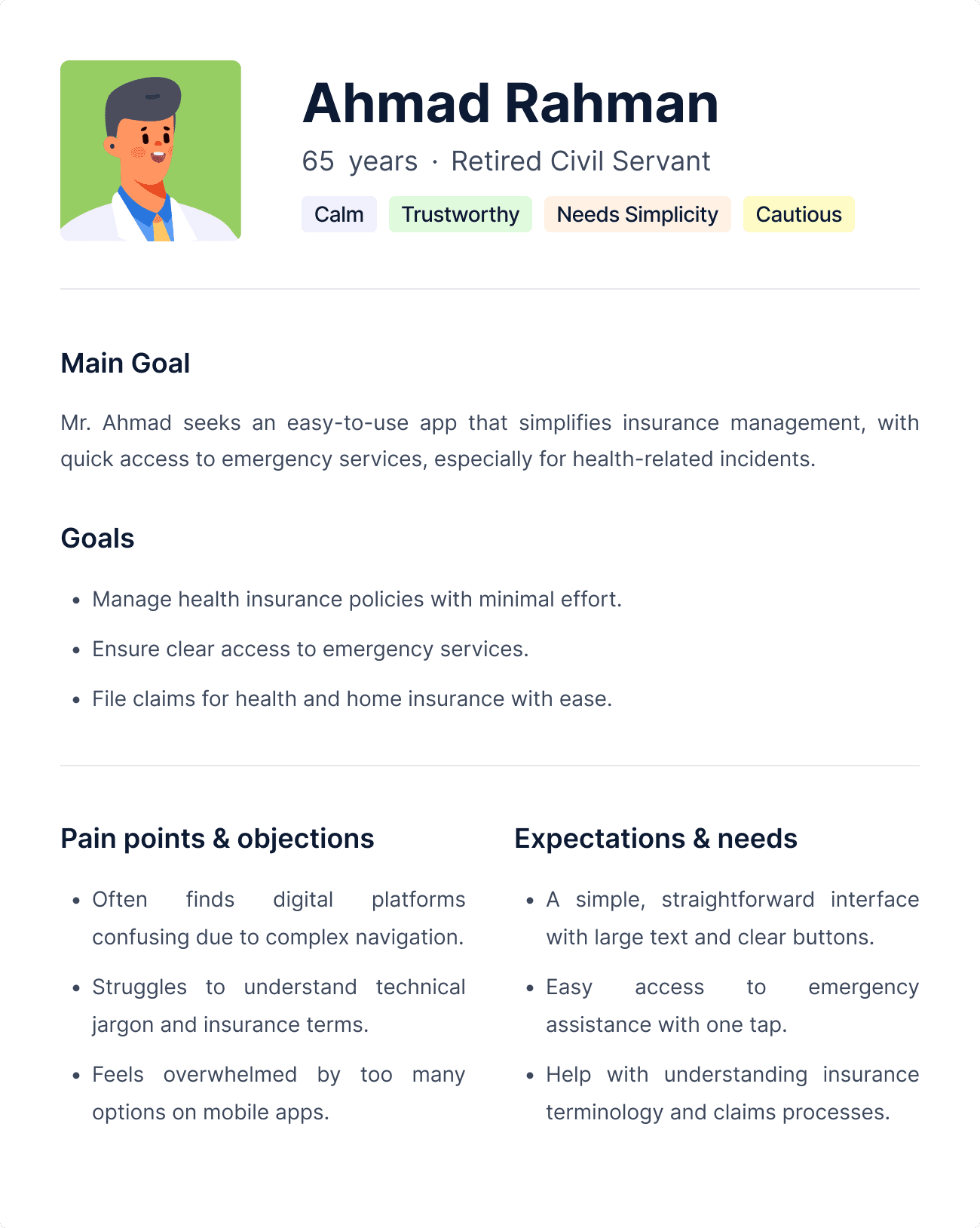
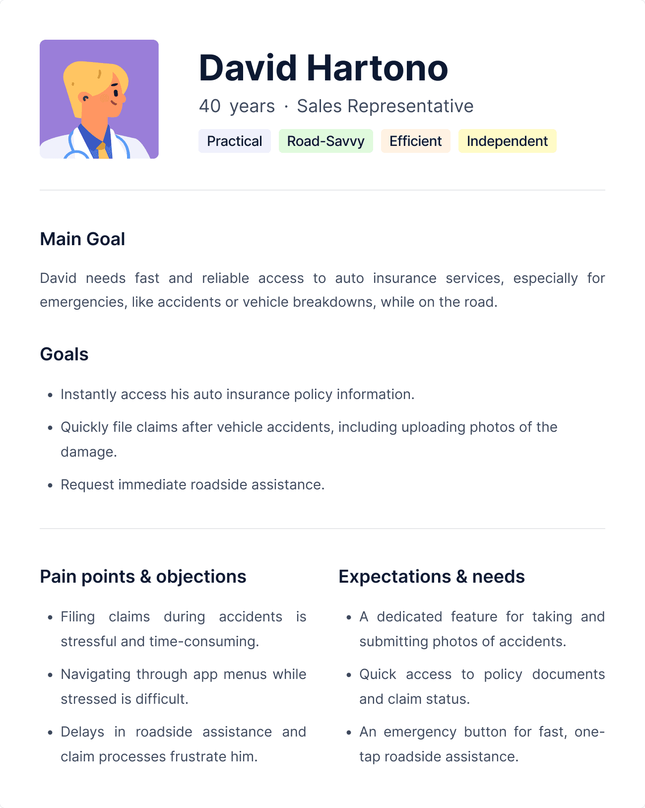
By developing three distinct user personas—Sarah (Busy Professional), Mr. Ahmad (Retiree), and David (Frequent Driver)—we gained a deep understanding of the diverse needs, goals, and challenges faced by MyGarda's users.
Sarah requires speed and efficiency due to her fast-paced lifestyle. For her, the app must provide quick access to insurance services with minimal steps, especially during high-pressure situations like filing a claim.
Mr. Ahmad values simplicity and clarity. The app needs to cater to users who may not be tech-savvy by offering a straightforward interface, large text, and easily accessible emergency assistance features.
David, as a frequent driver, depends on quick access to emergency services and auto insurance tools. He needs a reliable, one-tap emergency feature that provides immediate roadside assistance and streamlined claims for accidents.
Each persona guided our design decisions, ensuring that MyGarda delivers an intuitive and seamless experience, tailored to different user needs, whether it’s for busy professionals, retirees, or frequent drivers.
User Journey & Pain Point
User Journey & Pain Point
This section outlines the typical steps that each user takes when interacting with the MyGarda app, highlighting the pain points they experience along the way. For clarity, we’ll break this down by persona.
This section outlines the typical steps that each user takes when interacting with the MyGarda app, highlighting the pain points they experience along the way. For clarity, we’ll break this down by persona.
This section outlines the typical steps that each user takes when interacting with the MyGarda app, highlighting the pain points they experience along the way. For clarity, we’ll break this down by persona.
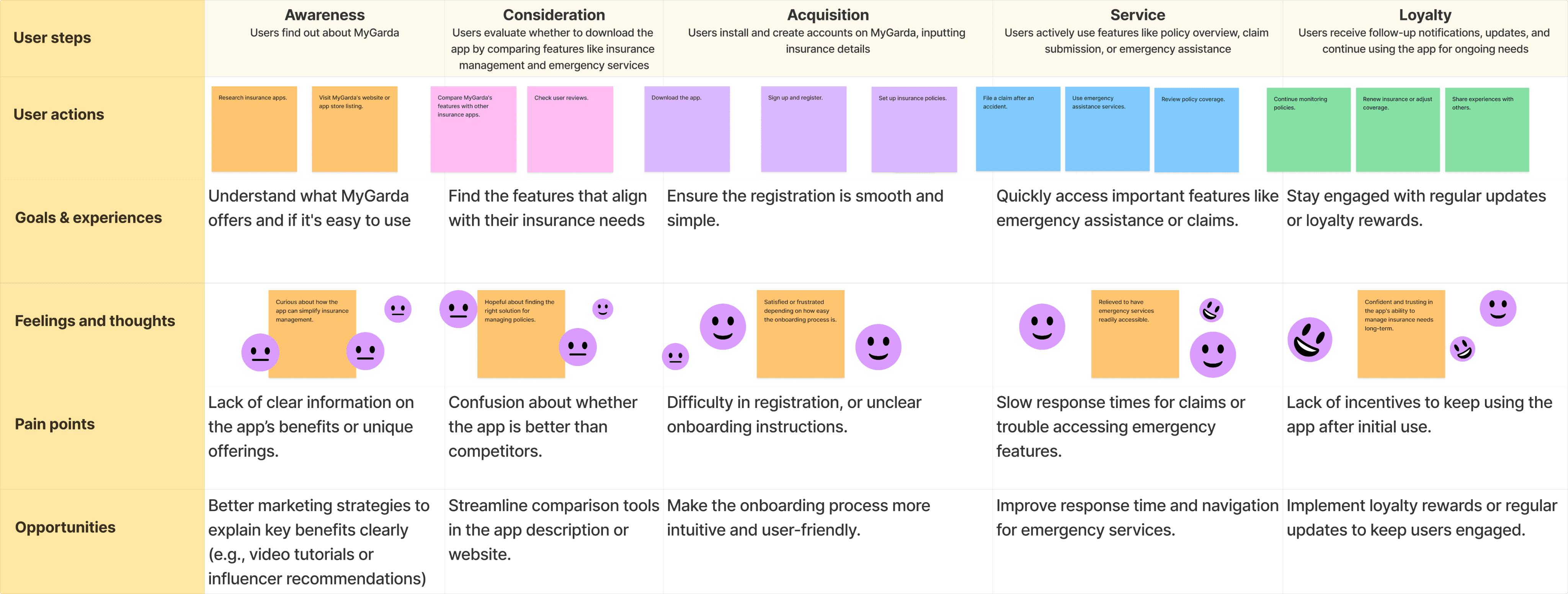
🎯 Conclusion from User Journeys
🎯 Conclusion from User Journeys
By mapping out these user journeys, we gained critical insights into how each persona interacts with the app in real-world scenarios. These journeys helped us design solutions that address their specific needs and remove pain points—whether it’s ensuring Sarah has a fast claim submission process, making Mr. Ahmad’s navigation simple, or providing David with immediate roadside assistance.
By mapping out these user journeys, we gained critical insights into how each persona interacts with the app in real-world scenarios. These journeys helped us design solutions that address their specific needs and remove pain points—whether it’s ensuring Sarah has a fast claim submission process, making Mr. Ahmad’s navigation simple, or providing David with immediate roadside assistance.
By mapping out these user journeys, we gained critical insights into how each persona interacts with the app in real-world scenarios. These journeys helped us design solutions that address their specific needs and remove pain points—whether it’s ensuring Sarah has a fast claim submission process, making Mr. Ahmad’s navigation simple, or providing David with immediate roadside assistance.
Design Process
Design Process
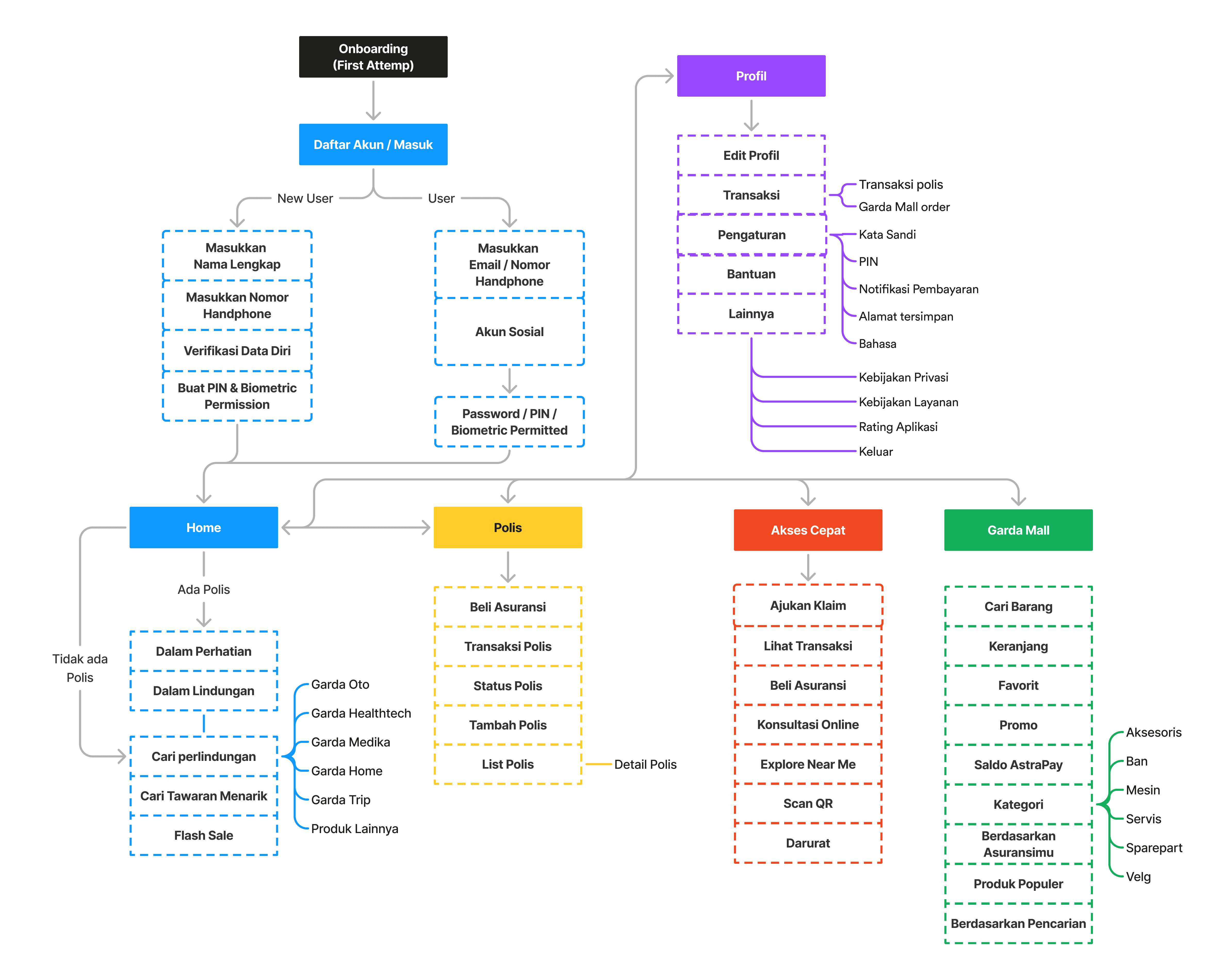
Information Architecture
Following the wireframe creation, we developed the app’s Information Architecture. I mapped out the hierarchy of the app’s content and navigation, ensuring that users could quickly find what they needed with minimal effort. The app’s IA was designed to be intuitive, grouping related features like insurance policies, claims, and emergency services together
Following the wireframe creation, we developed the app’s Information Architecture. I mapped out the hierarchy of the app’s content and navigation, ensuring that users could quickly find what they needed with minimal effort. The app’s IA was designed to be intuitive, grouping related features like insurance policies, claims, and emergency services together
Following the wireframe creation, we developed the app’s Information Architecture. I mapped out the hierarchy of the app’s content and navigation, ensuring that users could quickly find what they needed with minimal effort. The app’s IA was designed to be intuitive, grouping related features like insurance policies, claims, and emergency services together
Wireframe Sketches & Collaboration
Wireframe Sketches & Collaboration
Before diving into digital wireframes, I initiated the design process with my team by holding collaborative brainstorming sessions. We gathered together to sketch out initial concepts on paper, focusing on how the user would interact with the app’s core features. These hand-drawn sketches allowed us to quickly iterate ideas, considering different layouts and workflows for the key functionalities: emergency services, claims submission, and policy management.
Before diving into digital wireframes, I initiated the design process with my team by holding collaborative brainstorming sessions. We gathered together to sketch out initial concepts on paper, focusing on how the user would interact with the app’s core features. These hand-drawn sketches allowed us to quickly iterate ideas, considering different layouts and workflows for the key functionalities: emergency services, claims submission, and policy management.
Before diving into digital wireframes, I initiated the design process with my team by holding collaborative brainstorming sessions. We gathered together to sketch out initial concepts on paper, focusing on how the user would interact with the app’s core features. These hand-drawn sketches allowed us to quickly iterate ideas, considering different layouts and workflows for the key functionalities: emergency services, claims submission, and policy management.
The sketching phase encouraged open discussion and idea-sharing, which was crucial for shaping a user-friendly and intuitive app structure. These early sketches also helped us experiment with different ways to simplify complex processes, such as minimizing the number of steps needed to file a claim. After agreeing on a basic structure, we translated these sketches into low-fidelity wireframes using design tools, which formed the foundation for the subsequent design stages.
The sketching phase encouraged open discussion and idea-sharing, which was crucial for shaping a user-friendly and intuitive app structure. These early sketches also helped us experiment with different ways to simplify complex processes, such as minimizing the number of steps needed to file a claim. After agreeing on a basic structure, we translated these sketches into low-fidelity wireframes using design tools, which formed the foundation for the subsequent design stages.
The sketching phase encouraged open discussion and idea-sharing, which was crucial for shaping a user-friendly and intuitive app structure. These early sketches also helped us experiment with different ways to simplify complex processes, such as minimizing the number of steps needed to file a claim. After agreeing on a basic structure, we translated these sketches into low-fidelity wireframes using design tools, which formed the foundation for the subsequent design stages.

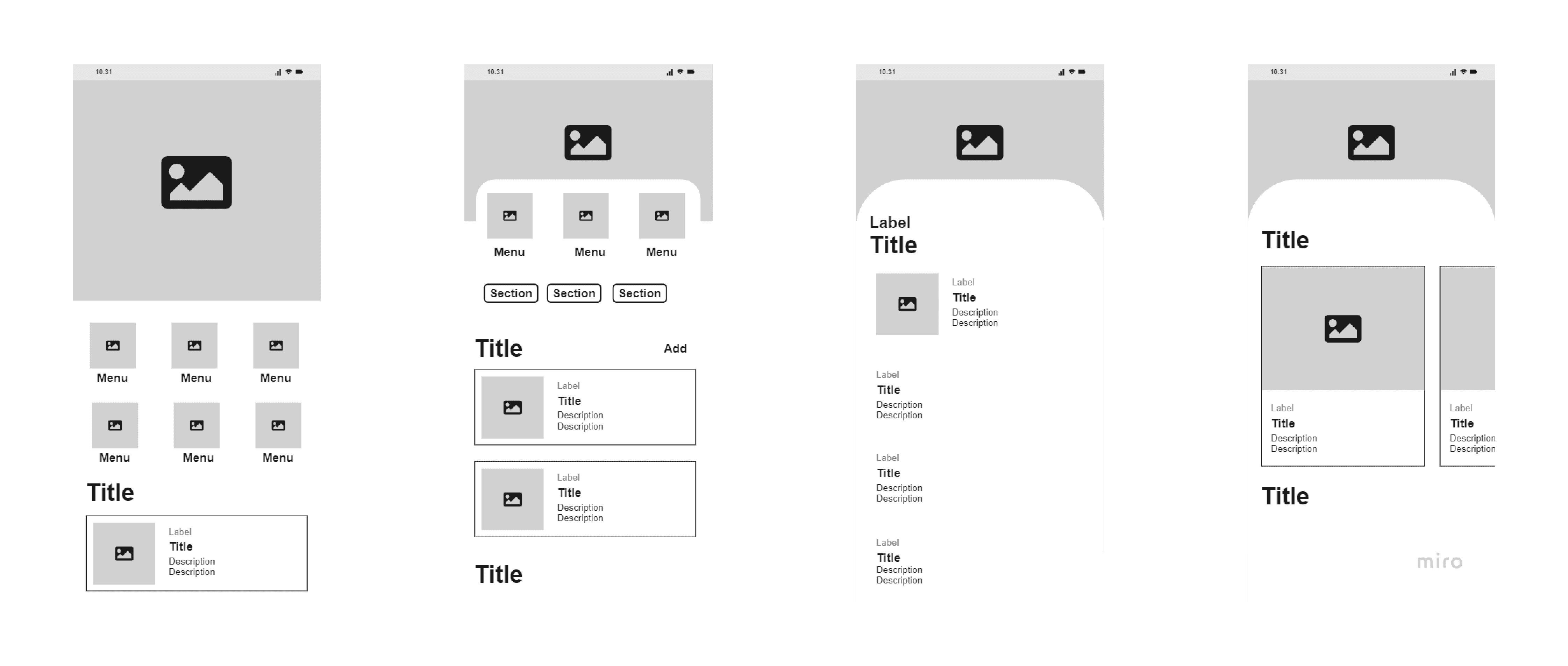
Mid-fidelity Wireframes
After developing the information architecture, we refined the wireframes into mid-fidelity wireframes, incorporating additional detail while keeping the design simple and functional. This phase allowed us to consider user interactions more deeply, placing key actions like the emergency button prominently on the home screen for immediate access. We use Miro to brainstorm and develop wireframes.
After developing the information architecture, we refined the wireframes into mid-fidelity wireframes, incorporating additional detail while keeping the design simple and functional. This phase allowed us to consider user interactions more deeply, placing key actions like the emergency button prominently on the home screen for immediate access. We use Miro to brainstorm and develop wireframes.
After developing the information architecture, we refined the wireframes into mid-fidelity wireframes, incorporating additional detail while keeping the design simple and functional. This phase allowed us to consider user interactions more deeply, placing key actions like the emergency button prominently on the home screen for immediate access. We use Miro to brainstorm and develop wireframes.
These wireframes were reviewed by stakeholders and users, and their feedback helped shape the design direction. For example, users expressed the need for faster access to emergency services, which led to revising the navigation to prioritize this function.
These wireframes were reviewed by stakeholders and users, and their feedback helped shape the design direction. For example, users expressed the need for faster access to emergency services, which led to revising the navigation to prioritize this function.
These wireframes were reviewed by stakeholders and users, and their feedback helped shape the design direction. For example, users expressed the need for faster access to emergency services, which led to revising the navigation to prioritize this function.
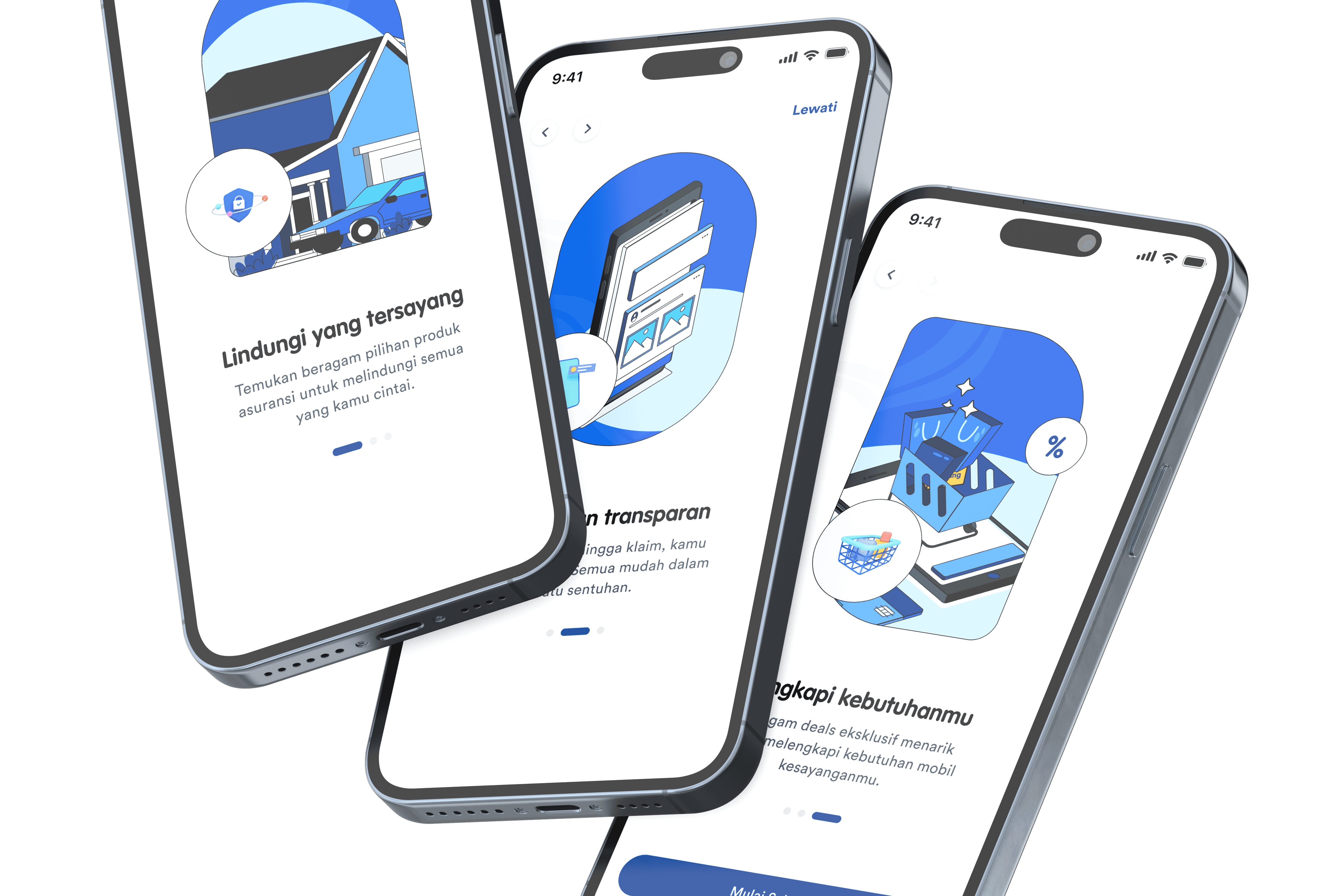
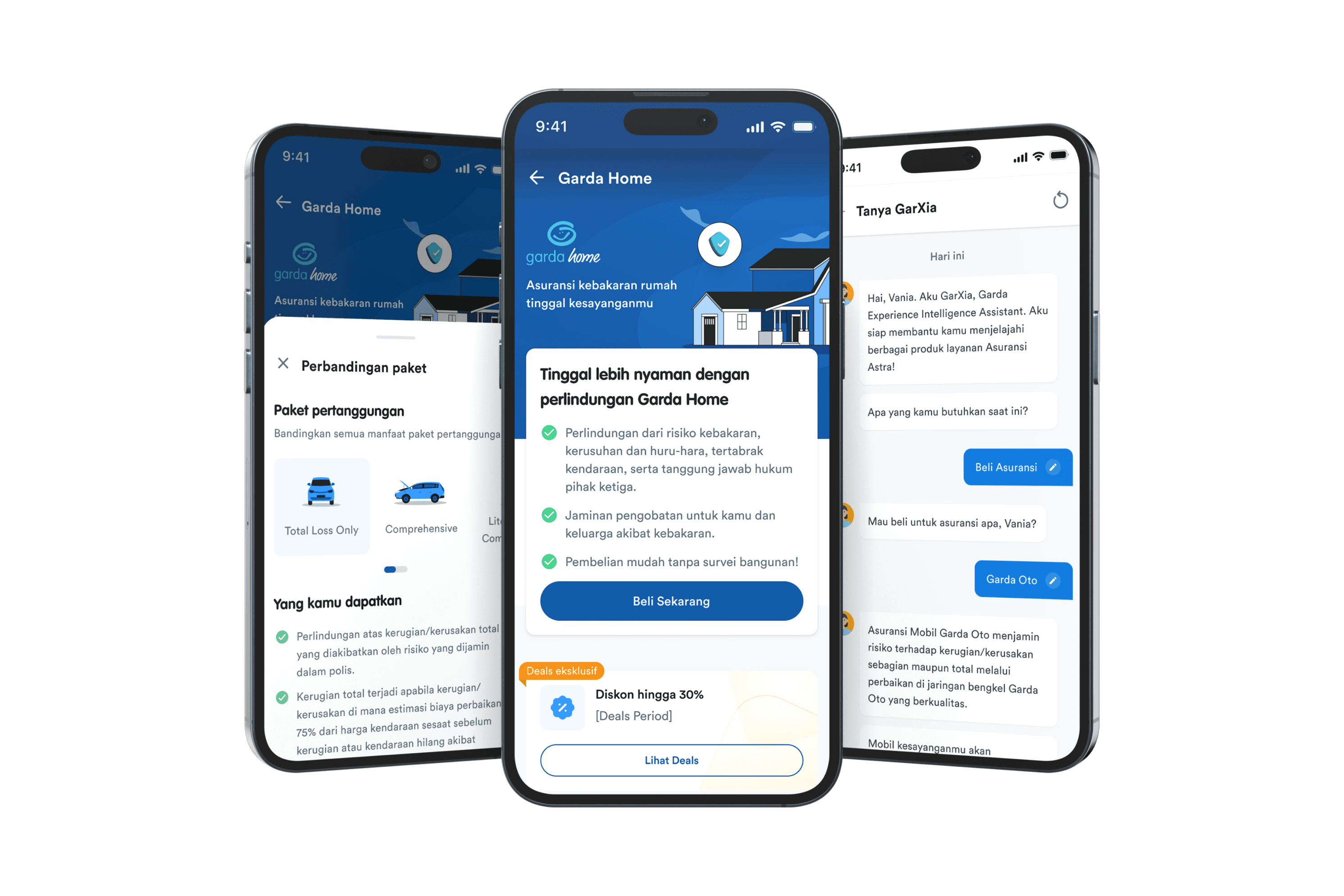
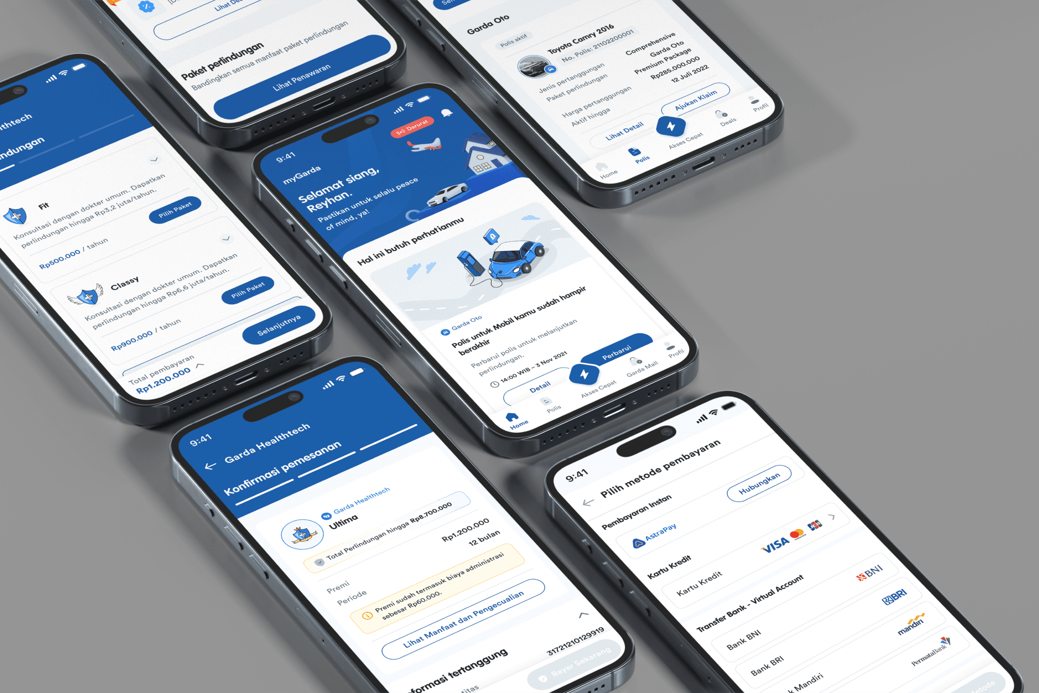
UI Design & High-fidelity Mockups
UI Design & High-fidelity Mockups
With the structure of the app solidified, we moved into the UI design phase and developed high-fidelity mockups. The design system for MyGarda was crafted with Asuransi Astra’s branding in mind, using a color palette and typography that aligned with their identity.
With the structure of the app solidified, we moved into the UI design phase and developed high-fidelity mockups. The design system for MyGarda was crafted with Asuransi Astra’s branding in mind, using a color palette and typography that aligned with their identity.
With the structure of the app solidified, we moved into the UI design phase and developed high-fidelity mockups. The design system for MyGarda was crafted with Asuransi Astra’s branding in mind, using a color palette and typography that aligned with their identity.
Special attention was given to creating a clean, modern interface that balanced aesthetics with functionality. Accessibility considerations, such as ensuring high contrast for visibility and using legible fonts, were applied throughout the design. For example, we used bold red for emergency buttons to create a sense of urgency while keeping other parts of the UI neutral and less overwhelming.
Special attention was given to creating a clean, modern interface that balanced aesthetics with functionality. Accessibility considerations, such as ensuring high contrast for visibility and using legible fonts, were applied throughout the design. For example, we used bold red for emergency buttons to create a sense of urgency while keeping other parts of the UI neutral and less overwhelming.
Special attention was given to creating a clean, modern interface that balanced aesthetics with functionality. Accessibility considerations, such as ensuring high contrast for visibility and using legible fonts, were applied throughout the design. For example, we used bold red for emergency buttons to create a sense of urgency while keeping other parts of the UI neutral and less overwhelming.
Prototyping
To simulate the user experience, we built an interactive prototype using Figma. This clickable prototype allowed stakeholders and users to interact with the key features, such as navigating through the dashboard, submitting a claim, and accessing emergency services. The prototype was used in initial rounds of testing to ensure the design was intuitive and met user needs.
To simulate the user experience, we built an interactive prototype using Figma. This clickable prototype allowed stakeholders and users to interact with the key features, such as navigating through the dashboard, submitting a claim, and accessing emergency services. The prototype was used in initial rounds of testing to ensure the design was intuitive and met user needs.
To simulate the user experience, we built an interactive prototype using Figma. This clickable prototype allowed stakeholders and users to interact with the key features, such as navigating through the dashboard, submitting a claim, and accessing emergency services. The prototype was used in initial rounds of testing to ensure the design was intuitive and met user needs.
Usability Testing
Usability Testing
Once the prototype was built, I conducted usability testing to validate the app's user flow and overall design. We tested with a small group of users representing different personas, including policyholders, drivers, and emergency service users.
The tests were designed to evaluate how easily users could navigate through the app’s core features, such as submitting claims, viewing policies, and accessing emergency services. Users were given specific tasks to complete, such as filing a claim or finding emergency assistance, while we observed their behavior and gathered feedback.
🎯 Key Findings from the Usability Tests
Emergency access: Users appreciated the prominent emergency button but requested a more noticeable distinction in color for faster recognition under stress.
Claims submission: Most users found the claims process intuitive but suggested providing more detailed status updates after submission, which we incorporated into the final design.
Navigation: A few users initially struggled with accessing their policies, so we made adjustments to the app’s navigation by simplifying the flow and grouping similar actions together.
Based on this feedback, we made adjustments to the prototype before finalizing the UI design. These changes improved the overall user experience by addressing pain points and ensuring the app's functionality met user expectations.
Based on this feedback, we made adjustments to the prototype before finalizing the UI design. These changes improved the overall user experience by addressing pain points and ensuring the app's functionality met user expectations.
Based on this feedback, we made adjustments to the prototype before finalizing the UI design. These changes improved the overall user experience by addressing pain points and ensuring the app's functionality met user expectations.
Reflection & Key Takeaways
Reflection & Key Takeaways
🎨 Collaborative Design Matters
Starting with hand-drawn sketches and team discussions allowed us to explore more ideas, leading to a well-rounded design. Early collaboration ensured diverse input and creativity in the wireframing process.🔍 The Power of User Research
Conducting thorough research and building user personas helped align the app’s features with real-world needs. Understanding different personas (like drivers and policyholders) enabled us to design a more targeted and user-friendly experience.🛠 Simplify Complex Tasks
Streamlining critical processes like claim submissions and emergency access was key. By reducing the number of steps, we ensured that users could complete important tasks efficiently, particularly under stress.🧑💻 Importance of Usability Testing
Gathering feedback during usability testing led to actionable insights, allowing us to refine the app’s navigation and functionality before launch. Iterating based on real user interactions improved the final product.🤝 Value of Team Collaboration
Working together with stakeholders and team members throughout the process ensured that all voices were heard, leading to a balanced design that met both business objectives and user needs.
User Research Methods
User Interviews
We conducted interviews with 20 current Asuransi Astra customers to gain insights into their experiences with managing insurance.
The focus was on their frustrations with current processes, what they expect from a mobile solution, and what their emergency service experiences have been.
Surveys
A broader survey was sent to over 100 customers to gather quantitative data on how they interact with insurance services and their comfort levels with mobile technology.
Key questions included:
How often do they need to file a claim?
How would they prefer to contact their insurer in an emergency?
What features do they most value in a mobile app?
Competitive Analysis
We analyzed the mobile apps of several competitors in the insurance sector to understand how they addressed user needs. Initially, we identified the differences among these apps and then examined their similarities. This process allowed us to pinpoint essential features that users expect and uncover opportunities where MyGarda could differentiate itself. Our analysis focused on enhancing usability and improving access to emergency services, aiming to provide a superior user experience.
Key Insights
From the research, several key insights emerged
⚡️ Speed & Simplicity Are Key
Users emphasized the need for a fast, straightforward process to access emergency services and submit claims, particularly in stressful situations like car accidents.
🎭 Clear Communication
Many users found insurance jargon confusing. They wanted simplified, easy-to-understand language when reviewing their policies and submitting claims.
❗️Emergency Access
Drivers and elderly users, in particular, wanted a “panic button” for emergencies—an easily accessible feature that connects them directly to help.
😵💫 Friction in Claim Filing
Users expressed frustration with the lengthy and complicated process of filing claims, particularly having to provide redundant information that should already be available in their policy.
🎯 Conclusion from Research
These insights directly informed the design of MyGarda, guiding decisions to make the app simple, user-friendly, and focused on providing fast access to critical features, especially for emergencies.
User Personas
Based on our research, we developed two primary user personas to represent key segments of MyGarda’s target audience. These personas guided our design decisions to ensure we addressed their specific needs and pain points.
🎯 Conclusion from Personas
By developing three distinct user personas—Sarah (Busy Professional), Mr. Ahmad (Retiree), and David (Frequent Driver)—we gained a deep understanding of the diverse needs, goals, and challenges faced by MyGarda's users.
Sarah requires speed and efficiency due to her fast-paced lifestyle. For her, the app must provide quick access to insurance services with minimal steps, especially during high-pressure situations like filing a claim.
Mr. Ahmad values simplicity and clarity. The app needs to cater to users who may not be tech-savvy by offering a straightforward interface, large text, and easily accessible emergency assistance features.
David, as a frequent driver, depends on quick access to emergency services and auto insurance tools. He needs a reliable, one-tap emergency feature that provides immediate roadside assistance and streamlined claims for accidents.
Each persona guided our design decisions, ensuring that MyGarda delivers an intuitive and seamless experience, tailored to different user needs, whether it’s for busy professionals, retirees, or frequent drivers.
User Journey & Pain Point
This section outlines the typical steps that each user takes when interacting with the MyGarda app, highlighting the pain points they experience along the way. For clarity, we’ll break this down by persona.
🎯 Conclusion from User Journeys
By mapping out these user journeys, we gained critical insights into how each persona interacts with the app in real-world scenarios. These journeys helped us design solutions that address their specific needs and remove pain points—whether it’s ensuring Sarah has a fast claim submission process, making Mr. Ahmad’s navigation simple, or providing David with immediate roadside assistance.
Design Process
Information Architecture
Following the wireframe creation, we developed the app’s Information Architecture. I mapped out the hierarchy of the app’s content and navigation, ensuring that users could quickly find what they needed with minimal effort. The app’s IA was designed to be intuitive, grouping related features like insurance policies, claims, and emergency services together
Wireframe Sketches & Collaboration
Before diving into digital wireframes, I initiated the design process with my team by holding collaborative brainstorming sessions. We gathered together to sketch out initial concepts on paper, focusing on how the user would interact with the app’s core features. These hand-drawn sketches allowed us to quickly iterate ideas, considering different layouts and workflows for the key functionalities: emergency services, claims submission, and policy management.
The sketching phase encouraged open discussion and idea-sharing, which was crucial for shaping a user-friendly and intuitive app structure. These early sketches also helped us experiment with different ways to simplify complex processes, such as minimizing the number of steps needed to file a claim. After agreeing on a basic structure, we translated these sketches into low-fidelity wireframes using design tools, which formed the foundation for the subsequent design stages.
Mid-fidelity Wireframes
After developing the information architecture, we refined the wireframes into mid-fidelity wireframes, incorporating additional detail while keeping the design simple and functional. This phase allowed us to consider user interactions more deeply, placing key actions like the emergency button prominently on the home screen for immediate access. We use Miro to brainstorm and develop wireframes.
These wireframes were reviewed by stakeholders and users, and their feedback helped shape the design direction. For example, users expressed the need for faster access to emergency services, which led to revising the navigation to prioritize this function.
UI Design & High-fidelity Mockups
With the structure of the app solidified, we moved into the UI design phase and developed high-fidelity mockups. The design system for MyGarda was crafted with Asuransi Astra’s branding in mind, using a color palette and typography that aligned with their identity.
Special attention was given to creating a clean, modern interface that balanced aesthetics with functionality. Accessibility considerations, such as ensuring high contrast for visibility and using legible fonts, were applied throughout the design. For example, we used bold red for emergency buttons to create a sense of urgency while keeping other parts of the UI neutral and less overwhelming.
Prototyping
To simulate the user experience, we built an interactive prototype using Figma. This clickable prototype allowed stakeholders and users to interact with the key features, such as navigating through the dashboard, submitting a claim, and accessing emergency services. The prototype was used in initial rounds of testing to ensure the design was intuitive and met user needs.
Usability Testing
Once the prototype was built, I conducted usability testing to validate the app's user flow and overall design. We tested with a small group of users representing different personas, including policyholders, drivers, and emergency service users.
The tests were designed to evaluate how easily users could navigate through the app’s core features, such as submitting claims, viewing policies, and accessing emergency services. Users were given specific tasks to complete, such as filing a claim or finding emergency assistance, while we observed their behavior and gathered feedback.
🎯 Key Findings from the Usability Tests
Emergency access: Users appreciated the prominent emergency button but requested a more noticeable distinction in color for faster recognition under stress.
Claims submission: Most users found the claims process intuitive but suggested providing more detailed status updates after submission, which we incorporated into the final design.
Navigation: A few users initially struggled with accessing their policies, so we made adjustments to the app’s navigation by simplifying the flow and grouping similar actions together.
Based on this feedback, we made adjustments to the prototype before finalizing the UI design. These changes improved the overall user experience by addressing pain points and ensuring the app's functionality met user expectations.
Reflection & Key Takeaways
🎨 Collaborative Design Matters
Starting with hand-drawn sketches and team discussions allowed us to explore more ideas, leading to a well-rounded design. Early collaboration ensured diverse input and creativity in the wireframing process.🔍 The Power of User Research
Conducting thorough research and building user personas helped align the app’s features with real-world needs. Understanding different personas (like drivers and policyholders) enabled us to design a more targeted and user-friendly experience.🛠 Simplify Complex Tasks
Streamlining critical processes like claim submissions and emergency access was key. By reducing the number of steps, we ensured that users could complete important tasks efficiently, particularly under stress.🧑💻 Importance of Usability Testing
Gathering feedback during usability testing led to actionable insights, allowing us to refine the app’s navigation and functionality before launch. Iterating based on real user interactions improved the final product.🤝 Value of Team Collaboration
Working together with stakeholders and team members throughout the process ensured that all voices were heard, leading to a balanced design that met both business objectives and user needs.
More Works More Works
More Works More Works
Niagahoster
Responsive Website
2023
2023
Niagahoster
Responsive Website
2023
2023
Niagahoster
Responsive Website
2023
2023
Niagahoster
Responsive Website
2023
2023
Garda Oto
Responsive Website
2023
2023
Garda Oto
Responsive Website
2023
2023
Garda Oto
Responsive Website
2023
2023
Garda Oto
Responsive Website
2023
2023
©2024 REYHAN AK
Go Back To Top
©2024 REYHAN AK
Go Back To Top